What it means
The shapes give a typeface its character: the curve of an a, the width of an M and the contrast between thick and thin strokes. A font is a particular implementation of that design. In everyday conversation the words overlap, but the distinction helps when choosing a family and then choosing its weights.
Use it in practice
Start with the actual words your page needs. Compare a headline, a paragraph, numbers and navigation labels before judging a face by its name alone.
Watch out for
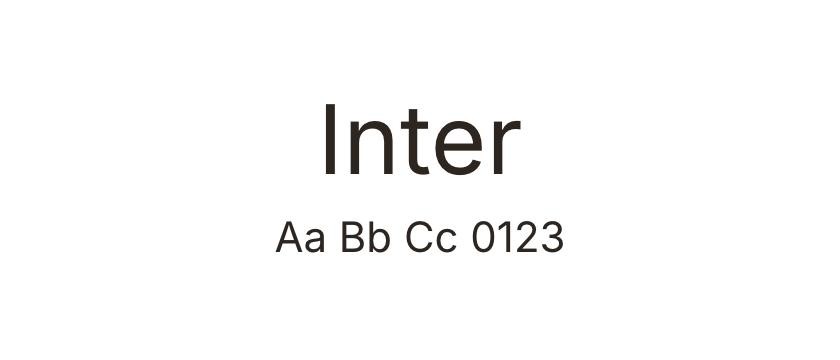
A striking alphabet sample does not guarantee readable body copy. Check small text and the characters required by your content.