What it means
This broad category includes geometric, humanist and grotesque designs with very different personalities. A sans serif can be practical and restrained or distinctive and expressive. Its suitability for a website depends on the actual shapes, spacing, weights and how it holds up in the content you need to show.
Use it in practice
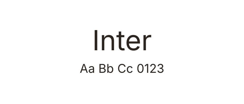
Compare similar-looking faces using difficult characters such as I, l and 1, plus the punctuation and numerals your interface needs.
Watch out for
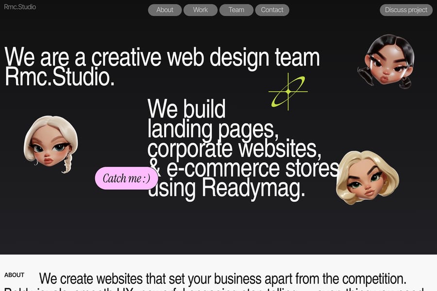
Do not equate sans serif with neutral or automatically more readable. A condensed display sans can be a poor choice for long paragraphs.