What it means
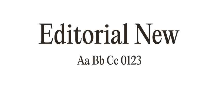
Serifs vary widely: some are bracketed into the main stroke, some are sharp and delicate, and others are broad slabs. The category includes quiet reading faces and highly expressive display designs, so the word serif alone says little about how a font will perform at a particular size.
Use it in practice
Try a serif when you want to explore a different rhythm or texture from a sans serif. Evaluate the specific design in your headline and body copy.
Watch out for
Fine strokes can disappear at small sizes or against busy imagery. Test the actual screen size and contrast.