Junjie Li
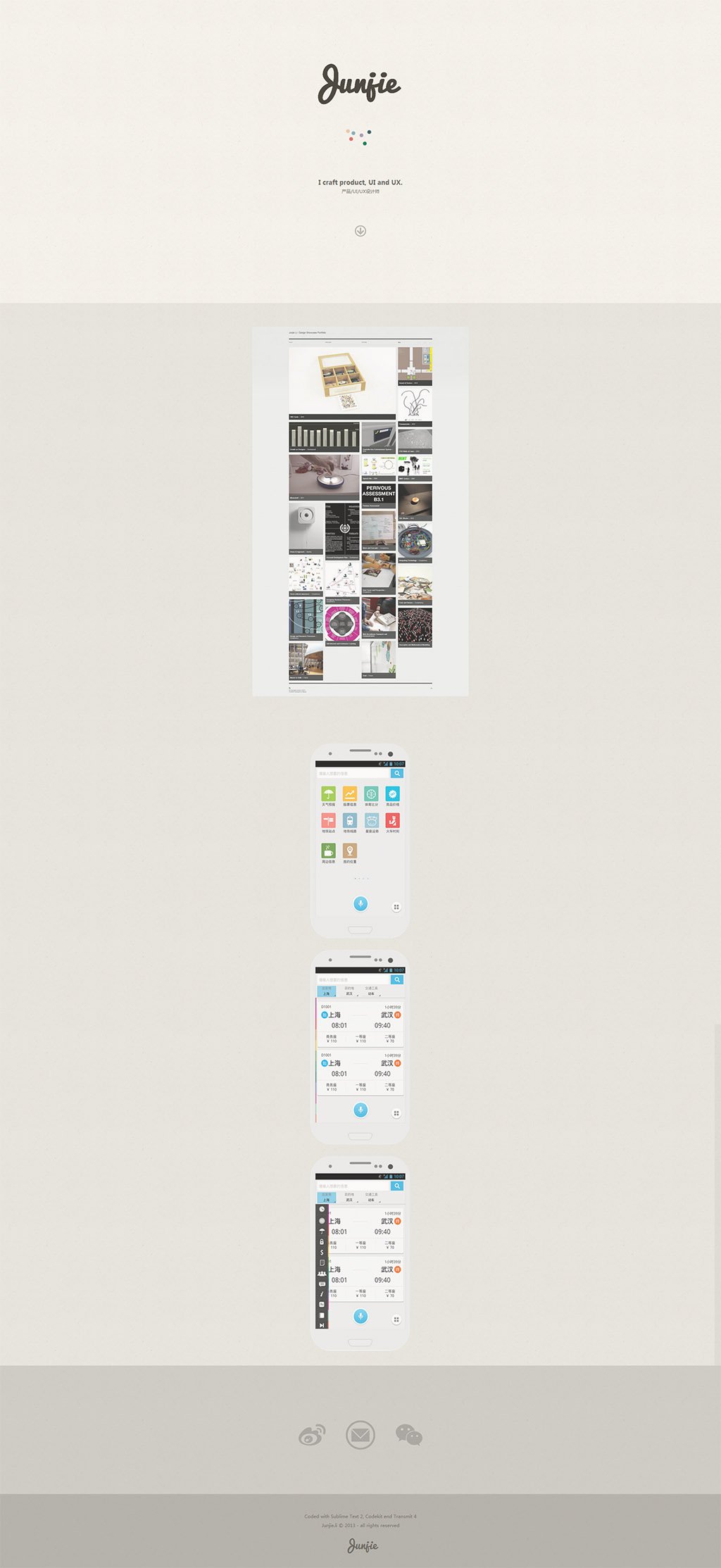
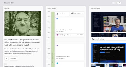
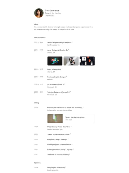
Author unknownJunjie Li’s One Page portfolio is clean and minimal with tons of breathing room. I feel it is a tad confusing with not enough info on the projects but love how you click the screenshots and it zooms in on UI features.
This website has unfortunately been redesigned or gone offline, so I have removed the direct link to it. The screenshot below hopefully preserved enough of the design but if you are really keen to inspect further, try this Archive.org link. FYI: the site was first featured on 13 May 2013.
