KITKAT
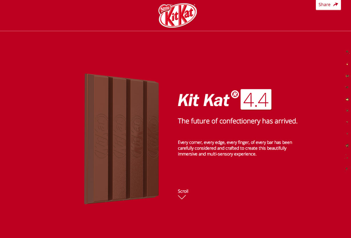
Author unknownThe new KitKat website is so awesome – featuring beautiful modern One Page web design techniques – that we’re going to overlook that (unnecessary) contact page link in the footer. Take this slick site for a spin to experience Nestle having a dig at Apple with this feature rich promo page for their popular KitKat chocolate. Brilliant.
This website has unfortunately been redesigned or gone offline, so I have removed the direct link to it. The screenshot below hopefully preserved enough of the design but if you are really keen to inspect further, try this Archive.org link. FYI: the site was first featured on 04 September 2013.
