Munutta
 Madebyvadim
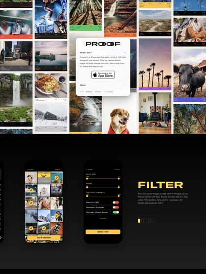
Nice little opening load transition in this launching soon page for an upcoming photo sharing iPhone called ‘Munutta’. The second section transition seems a touch jumpy and feels like the slider demo should be a bit bigger. I like what they are going for though.
This website has unfortunately been redesigned or gone offline, so I have removed the direct link to it. The screenshot below hopefully preserved enough of the design but if you are really keen to inspect further, try this Archive.org link. FYI: the site was first featured on 11 June 2014.
