Nick Guziuk
Author unknownThere is just something refreshing about Nick Guziuk’s portfolio layout. It’s busy but actually quite simple with all the info you need to find out if you want to hire him or not. Nice one Nick!
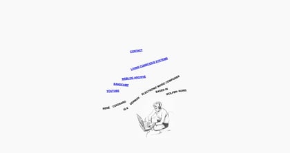
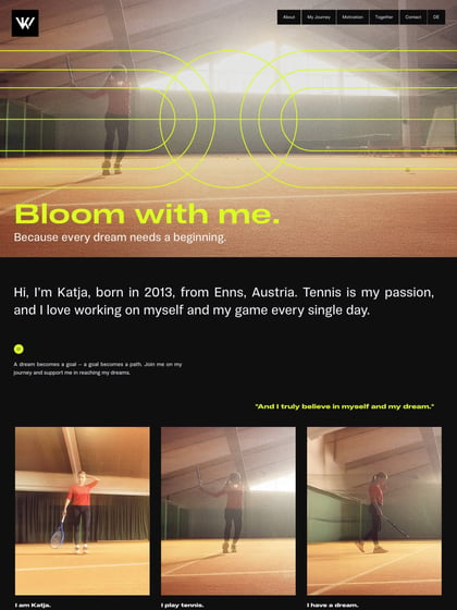
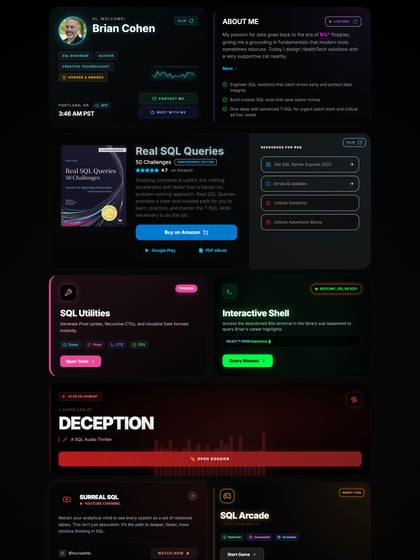
This website has unfortunately been redesigned or gone offline, so I have removed the direct link to it. The screenshot below hopefully preserved enough of the design but if you are really keen to inspect further, try this Archive.org link. FYI: the site was first featured on 22 April 2013.

