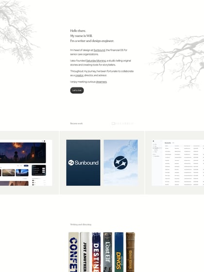
Spiegel Made
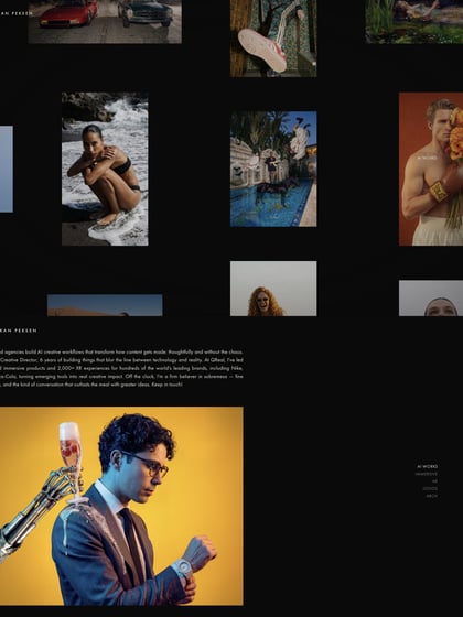
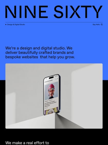
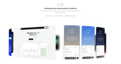
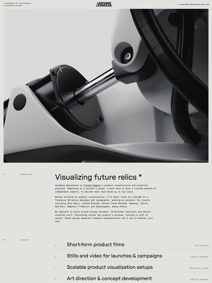
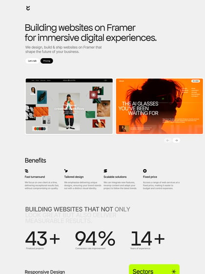
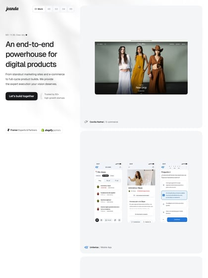
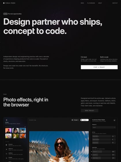
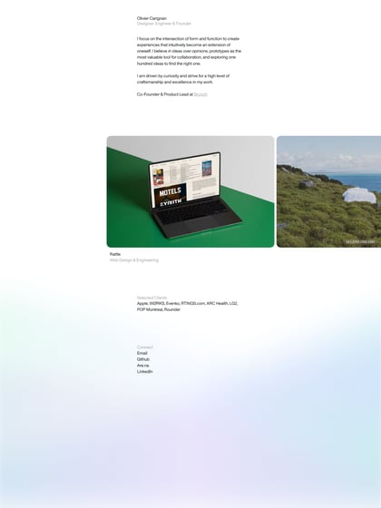
Author unknownReally like this minimalist approach to a One Page portfolio by Toronto product designer, Spiegel Made. Fills a big screen well but pity no slick mobile adaption.
This website has unfortunately been redesigned or gone offline, so I have removed the direct link to it. The screenshot below hopefully preserved enough of the design but if you are really keen to inspect further, try this Archive.org link. FYI: the site was first featured on 17 October 2013.
Features
Fixed FooterIcons

