Vtcreative
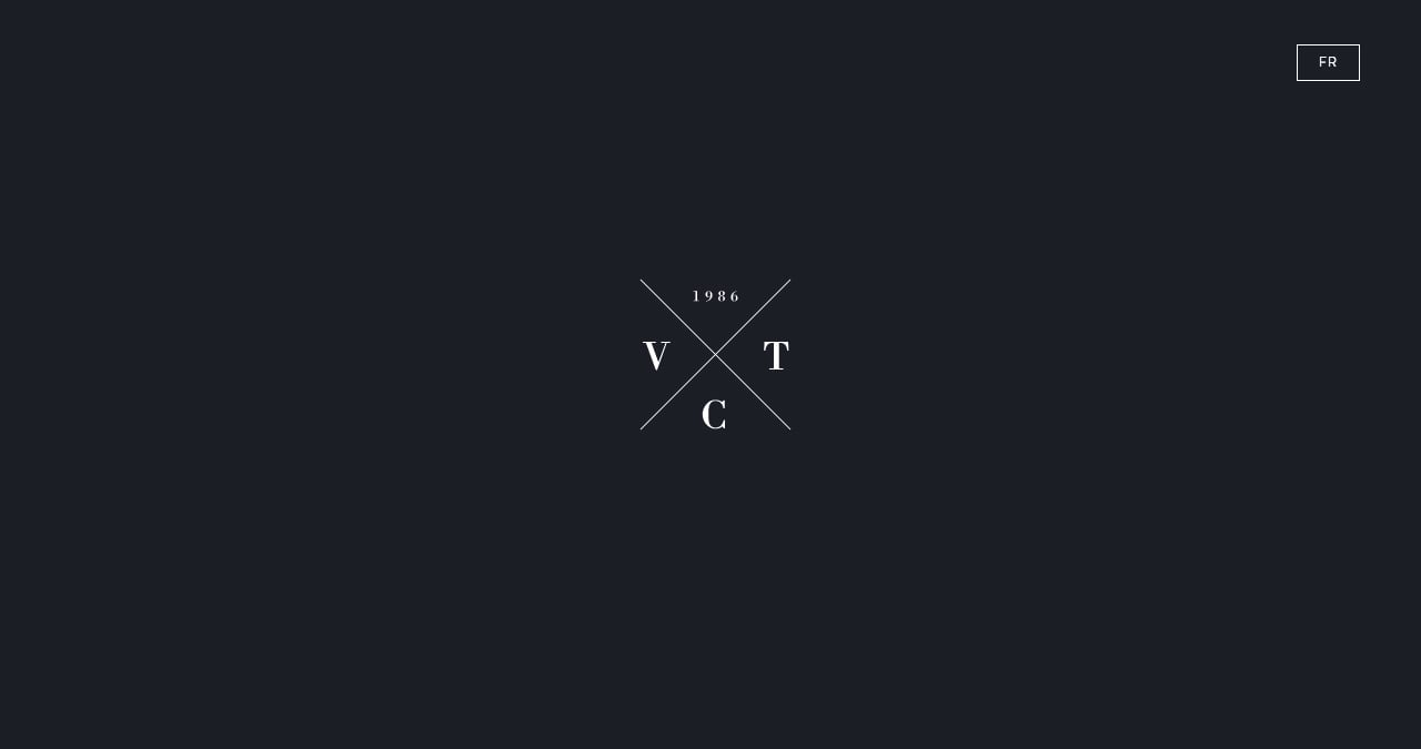
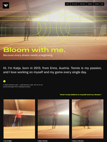
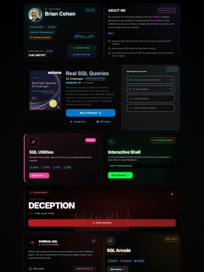
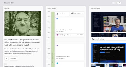
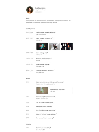
Author unknownBeautiful load transitions and use of whitespace in this minimal One Page portfolio for French UI/UX designer, Vincent Tantardini. Just love how the contact form loads up and also how the send button appears only once you click in the message area. Also great touch with the logo transition into down arrow. Great job Vincent.
This website has unfortunately been redesigned or gone offline, so I have removed the direct link to it. The screenshot below hopefully preserved enough of the design but if you are really keen to inspect further, try this Archive.org link. FYI: the site was first featured on 19 February 2014.
