Why Interactive
 Why Interactive
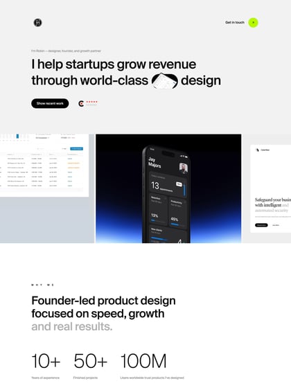
Unique horizontal scrolling One Pager for digital agency ‘Why Interactive’ from Hong Kong. I feel the keyboard browsing gets a bit lost in the portfolio section but the site fills a big monitor quite well and lovely touch with the animated handwriting signatures in the team member section.
This website has unfortunately been redesigned or gone offline, so I have removed the direct link to it. The screenshot below hopefully preserved enough of the design but if you are really keen to inspect further, try this Archive.org link. FYI: the site was first featured on 18 February 2014.

