Flywheel Co.
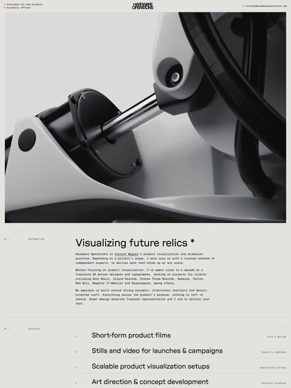
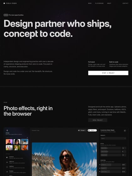
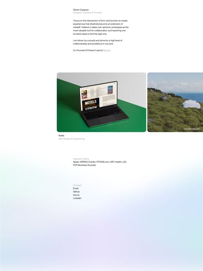
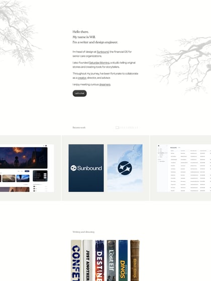
Author unknownGood use of whitespace and thin lines to create a slick minimalistic aesthetic in this One Pager for Flywheel Co. digital agency . The site features an interesting floating left navigation that actually works well. Lovely touch with subtle highlight/fill transition on the form submit button once all fields are populated.
This website has unfortunately been redesigned or gone offline, so I have removed the direct link to it. The screenshot below hopefully preserved enough of the design but if you are really keen to inspect further, try this Archive.org link. FYI: the site was first featured on 24 January 2014.

