Jesper Landberg
 Jesper Landberg
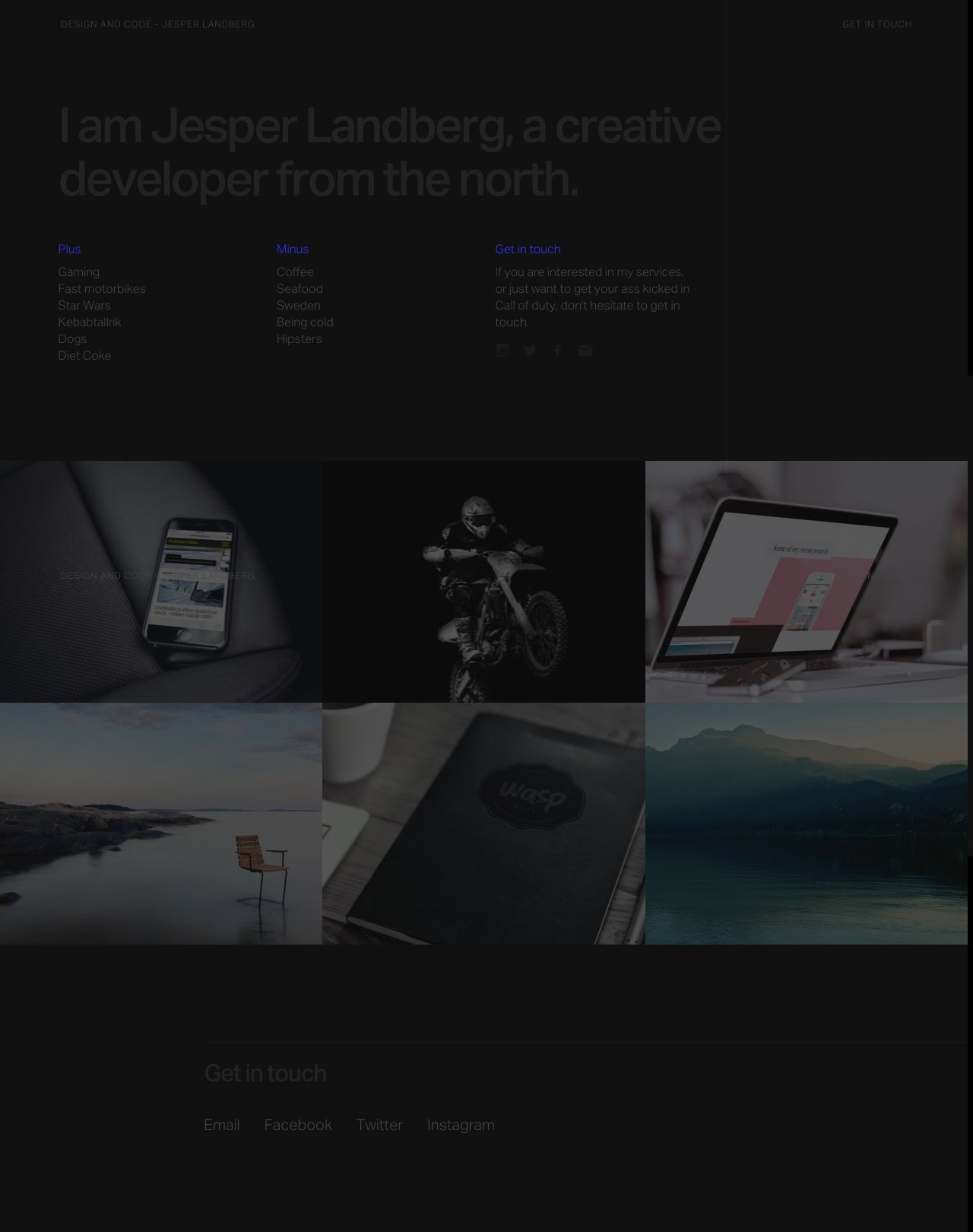
Dark schemed One Page portfolio redesign for Swedish web designer, Jesper Landberg. I think it’s debatable if this text color contrast is enough against the dark background. Always been a fan of the “glitch” effect and I really like the project load transitions with that subtle zoom.
This website has unfortunately been redesigned or gone offline, so I have removed the direct link to it. The screenshot below hopefully preserved enough of the design but if you are really keen to inspect further, try this Archive.org link. FYI: the site was first featured on 10 November 2015.
