Knock Knock
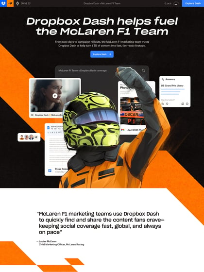
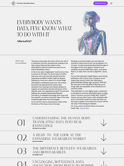
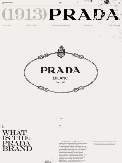
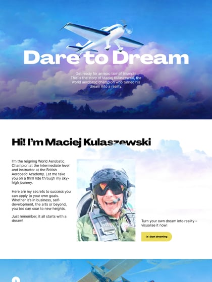
Author unknownLong One Pager forming a case study for ‘Knock Knock’ while demonstrating how Dutch agency, Studio Kwik, go about their work process. (The big screenshot has been reduced in length for load time consideration)
This website has unfortunately been redesigned or gone offline, so I have removed the direct link to it. The screenshot below hopefully preserved enough of the design but if you are really keen to inspect further, try this Archive.org link. FYI: the site was first featured on 20 February 2015.

