ROKIVO
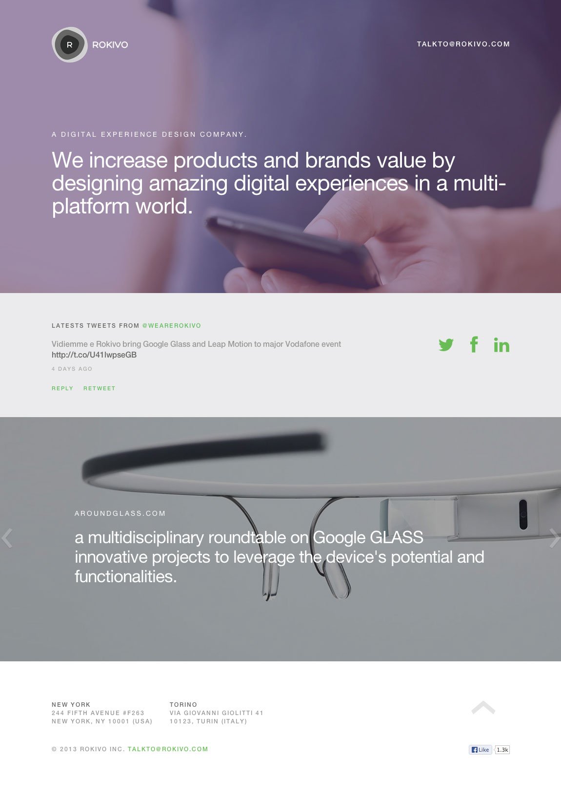
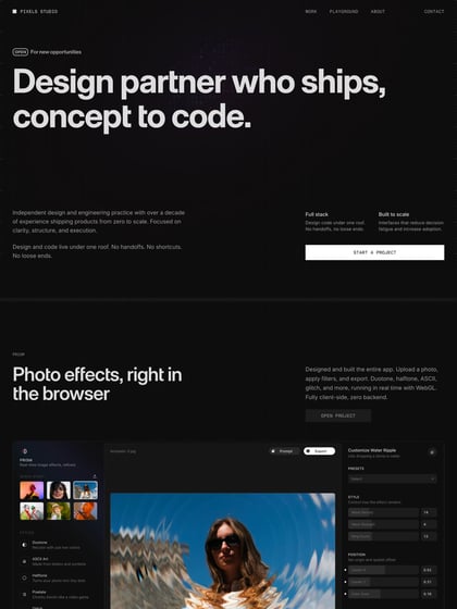
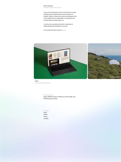
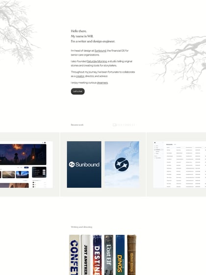
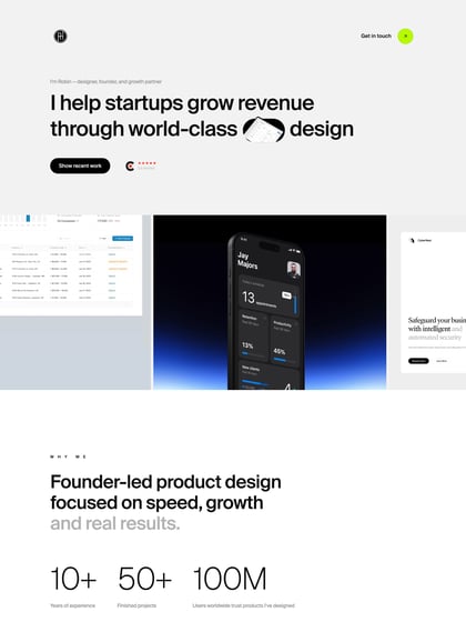
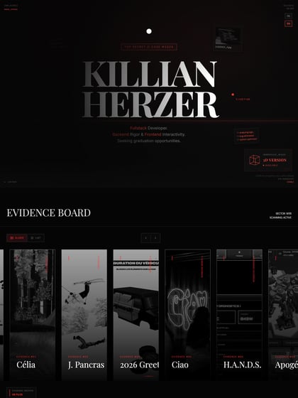
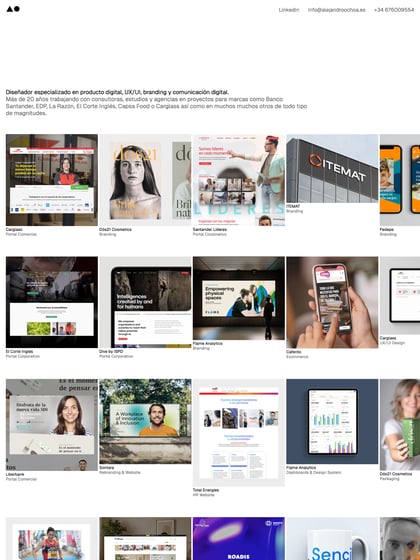
Author unknownLove the simplicity of this One Pager for digital agency Rokivo. I’m especially fond of how they’ve designed the portfolio section with a slider of 100% width images of the client products instead of screenshots. A great example of how less is more.
This website has unfortunately been redesigned or gone offline, so I have removed the direct link to it. The screenshot below hopefully preserved enough of the design but if you are really keen to inspect further, try this Archive.org link. FYI: the site was first featured on 22 September 2013.
