San Andrea
 Hangar
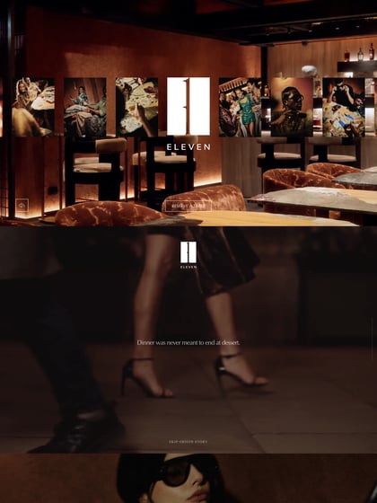
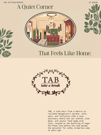
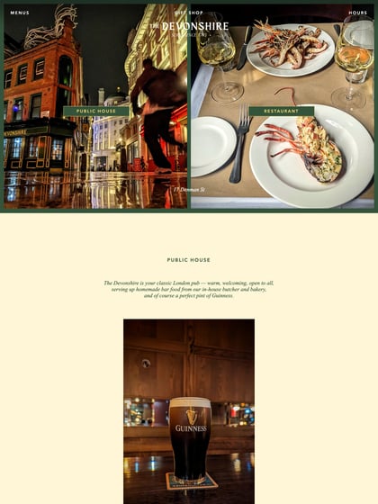
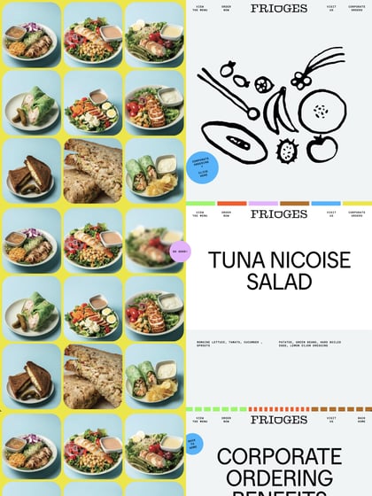
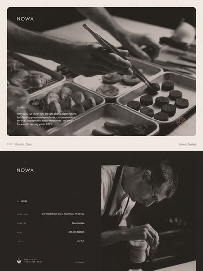
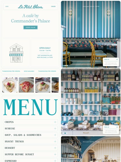
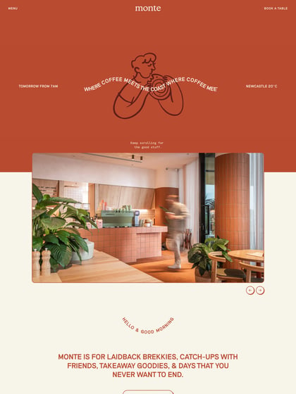
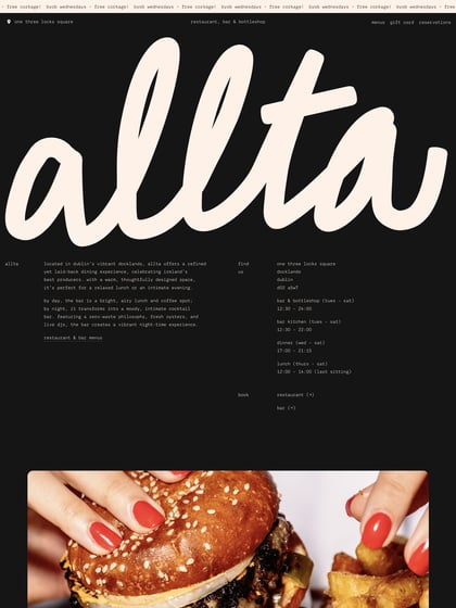
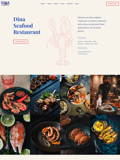
Elegant flat design in this One Pager for San Andrea, a restaurant part of the Palazzo Castelletti chain. This Landing Page is a great reference of the term less-is-more: a good font choice (Brandon Grotesque), a few quality images and some considerate whitespace with just the right amount content. This combination instantly associates a sense of quality and professionalism toward the brand.
This website has unfortunately been redesigned or gone offline, so I have removed the direct link to it. The screenshot below hopefully preserved enough of the design but if you are really keen to inspect further, try this Archive.org link. FYI: the site was first featured on 03 January 2014.

