Vic Jerczynski
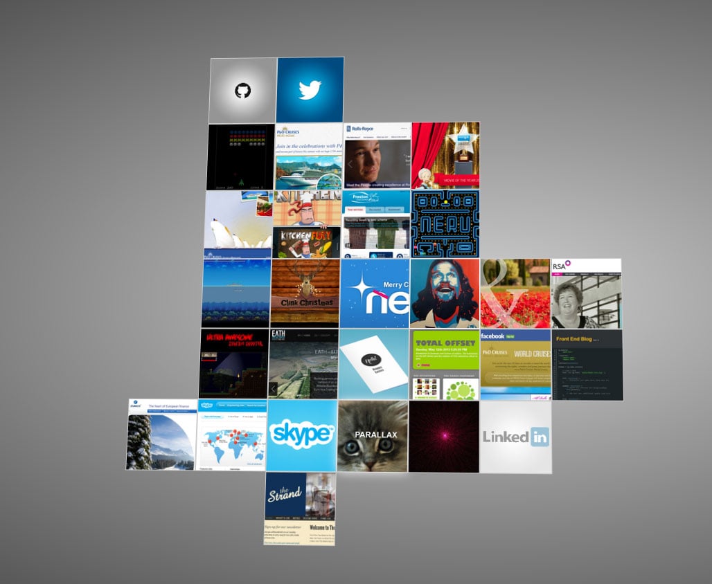
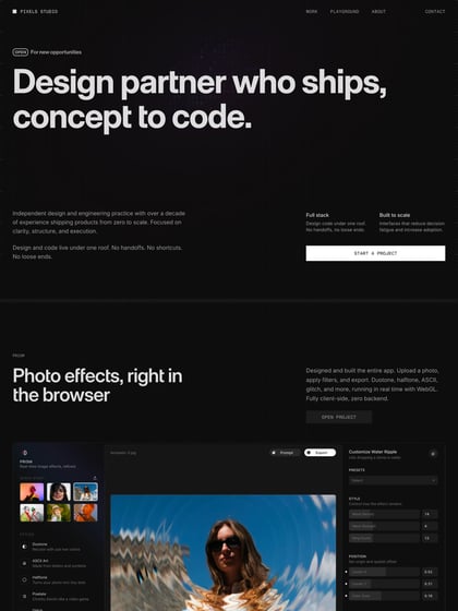
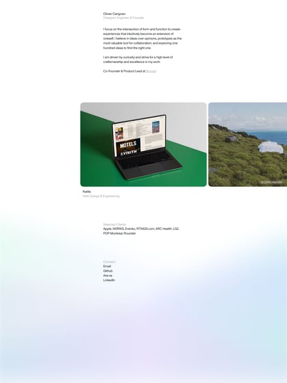
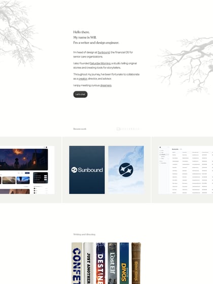
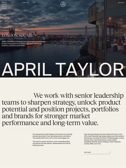
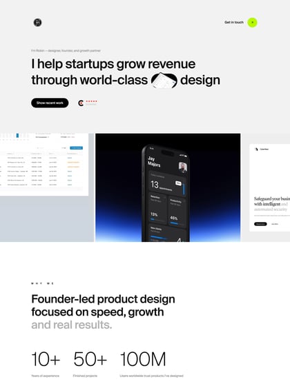
Author unknownA little logo and a background texture would have made a difference I think but great reference for a very unique One Page portfolio layout. Responsive too!
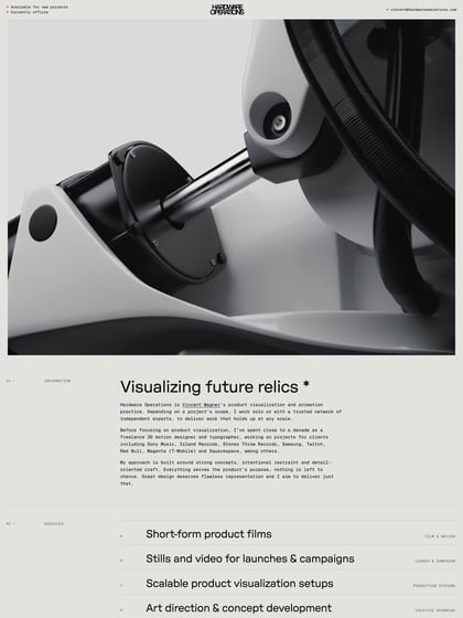
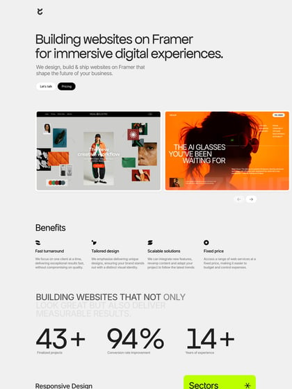
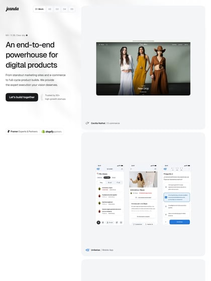
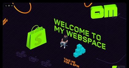
This website has unfortunately been redesigned or gone offline, so I have removed the direct link to it. The screenshot below hopefully preserved enough of the design but if you are really keen to inspect further, try this Archive.org link. FYI: the site was first featured on 13 June 2013.
