Villa Flora
 Atua Agência
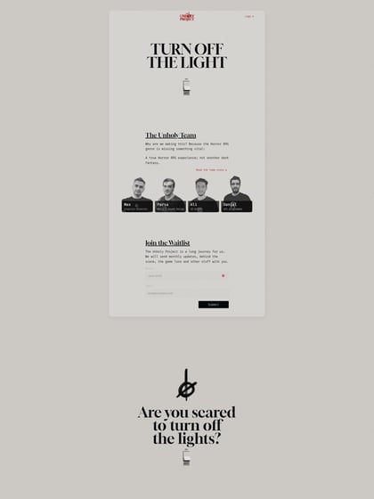
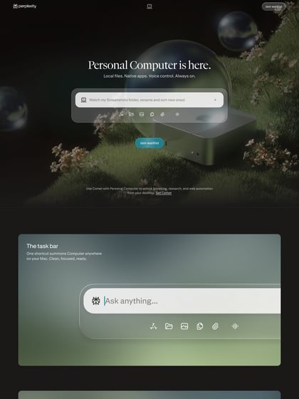
Long One Pager advertising a private ‘neighbourhood’ in the Brazilian countryside. I’m finding it hard to understand that green in the footer and also feel the hover sensitive effect on the intro image is unnecessary but they’ve done well with presenting a lot of content in a brochure style – which I’m sure was in the brief.
This website has unfortunately been redesigned or gone offline, so I have removed the direct link to it. The screenshot below hopefully preserved enough of the design but if you are really keen to inspect further, try this Archive.org link. FYI: the site was first featured on 24 June 2014.

