Fakeer
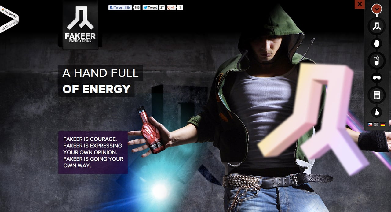
Author unknownNot the best looking preloader but spot on with concept. Fakeer seems like a pretty bad ass drink and their design correlates with their image. Mega parallax scrolling against a solid background with a grunge feel. With a market so saturated you’ll need this first impression for new users to remember you when scanning supermarket shelves.
This website has unfortunately been redesigned or gone offline, so I have removed the direct link to it. The screenshot below hopefully preserved enough of the design but if you are really keen to inspect further, try this Archive.org link. FYI: the site was first featured on 01 June 2012.
