Francesco Prisco
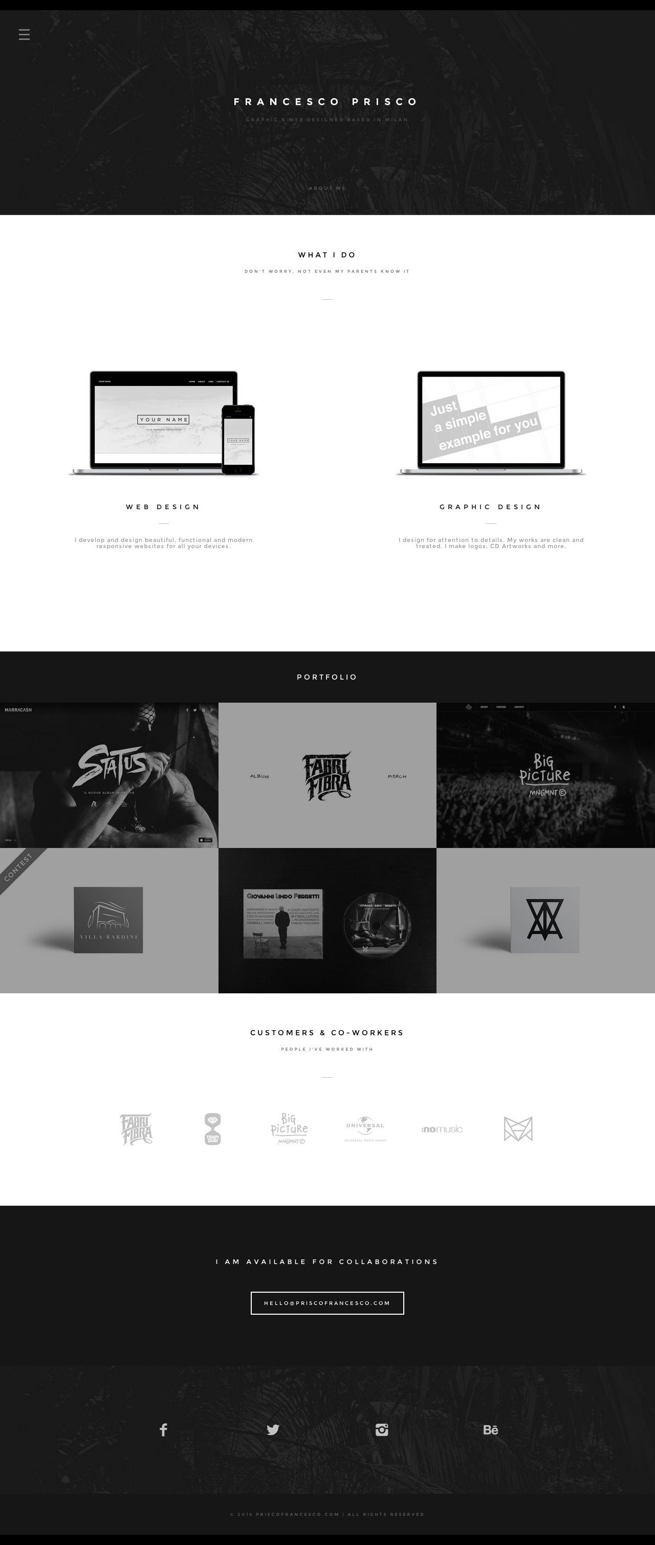
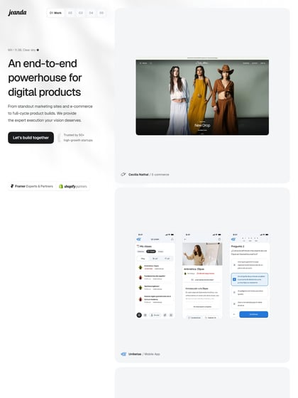
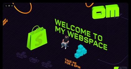
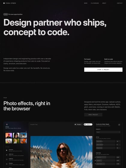
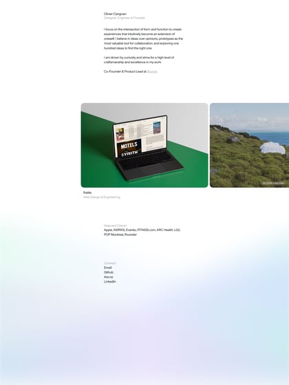
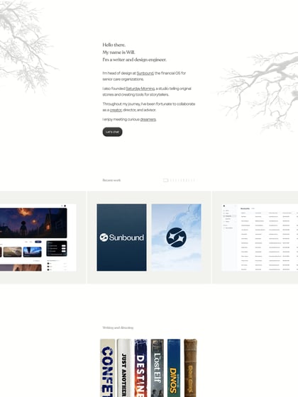
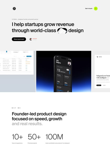
Author unknownClean flat design and good use of whitespace in this One Page portfolio for Milan based graphic designer, Francesco Prisco. Some of the font is perhaps a touch small but it works for sure. I’m feeling a slight Squarespace influence but I think it could just be the slick design along with an off-canvas navigation menu. Also nice touch with the footer icon hover colors matching the relevant social network brand.
This website has unfortunately been redesigned or gone offline, so I have removed the direct link to it. The screenshot below hopefully preserved enough of the design but if you are really keen to inspect further, try this Archive.org link. FYI: the site was first featured on 28 July 2014.
