Email newsletter publications are on the rise.
From curating interesting links to personal insight on specific topics; if you and can provide enough value to your niche community you can grow a thriving newsletter.
My favorite website builder Squarespace is a fantastic solution if you are considering starting an email newsletter.
Their all-in-one platform allows you to capture leads through a stunning mobile-friendly Landing Page, send to those leads using Squarespace Email Marketing and even charge a subscription for bonus/premium content using Squarespace Member Areas. No need to sign up for several different services.
In this tutorial I share 5 tips to help increase those first sign ups in your newsletter Landing Page, while taking a look at how the Squarespace platform can assist along the way. Let’s dive in!
One Page Love Exclusive Coupon
Yay! Squarespace has been kind enough to give One Page Love readers the exclusive coupon OPL10 for 10% Off* your first website or domain purchase. (There is a free 14-day trial with no credit card needed, so you can try risk-free.)
Tutorial Steps
- Embed your form above fold
- Tailor your headline copy
- Include social proof
- Add testimonials providing value
- Preview a newsletter send
- Bonus: Test the mobile sign up
- Paid Newsletter Bonus: Add a clear pricing table
1. Embed your form above fold
Tip #01 is to embed your email capture form right at the top of your landing page. This will allow visitors to input their email and subscribe without needing to scroll down. Remember not everyone scrolls!
Here I insert a Newsletter content section into a blank Squarespace landing page:
Within the Newsletter context block settings you can:
- Change the copy and design
- Sync the form to Squarespace Email Campaigns
For better tutorial context I’m going to create a fictitious landing page for the Weekly Roast newsletter targeted at coffee lovers ☕️
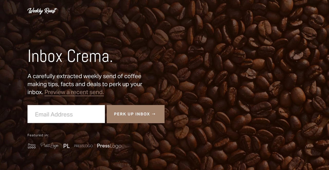
To spice up the header design, I’ve decided to add a coffee bean background image:
Note how I then assign the Dark 1 color scheme to change the header section text from dark to light.
2. Tailor your headline copy
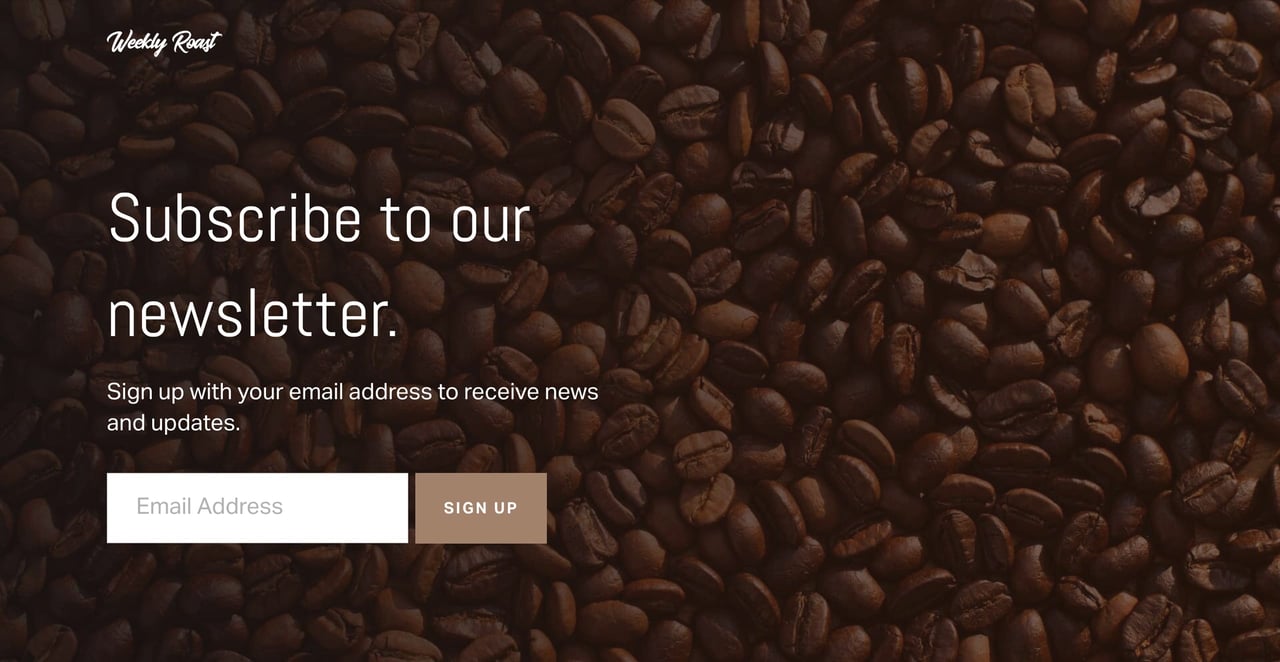
Let’s take a look at our Landing Page so far using the placeholder Squarespace copy:
Very legible but feels generic.
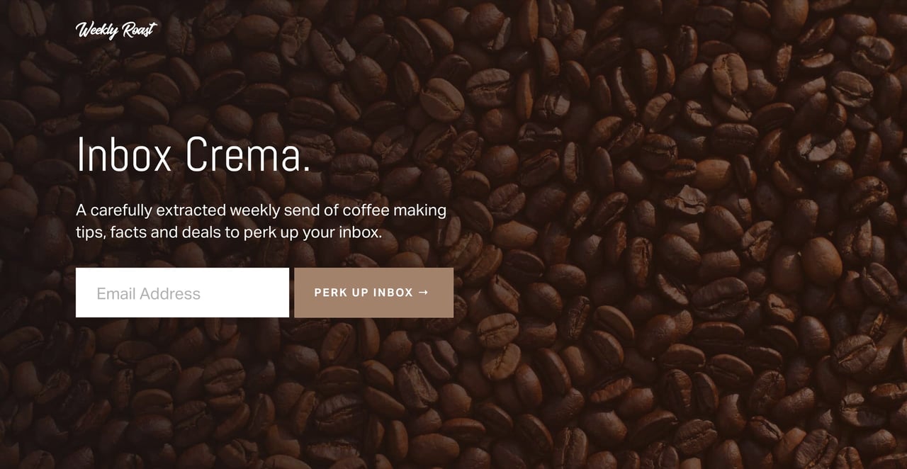
Tip #02 is to tailor your headline and subtext using nuances your niche would appreciate. Let’s spice it up:
Adding personality is what makes your newsletter stand out from the rest.
Note how I also spiced up the call-to-action button with Perk Up Inbox text.
Tailoring copy relatable to your community will increase your Landing Page sign ups as visitors will assume you have years in the game to know these terms.
3. Include social proof
Tip #03 is to add as much social proof as you can gather online and off.
Think of social proof as herd mentality. We tend to follow bigger herds vs. smaller herds. We are influenced by higher ratings vs. lower ratings. If everyone else is doing it, it must be the best and safest bet.
Here are some examples of social proof for a newsletter:
- How many newsletter subscribers do you have?
- What is your newsletter open rate?
- Where has your newsletter been mentioned?
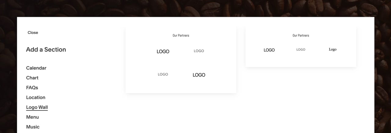
Squarespace has a neat Logo Wall section to add press logos where you have been featured:
But I want to add the press logos closer to the sign up form so I insert them as an image below the form like this:
Tip: To resize images integrated between a few content blocks, use Spacers. Simply position the spacer alongside the image and drag the edge accordingly. It’s real easy:
4. Add testimonials providing value
Tip #04 is to include testimonials highlighting newsletter features or answering any questions your potential subscriber could have.
Try avoid generic testimonials like “this newsletter is great” but take the opportunity to handpick testimonials actually explaining your newsletter.
Remember less is more (3 strong testimonials is better than 9 average) and if possible highlight testimonials from opinion leader’s within your community.
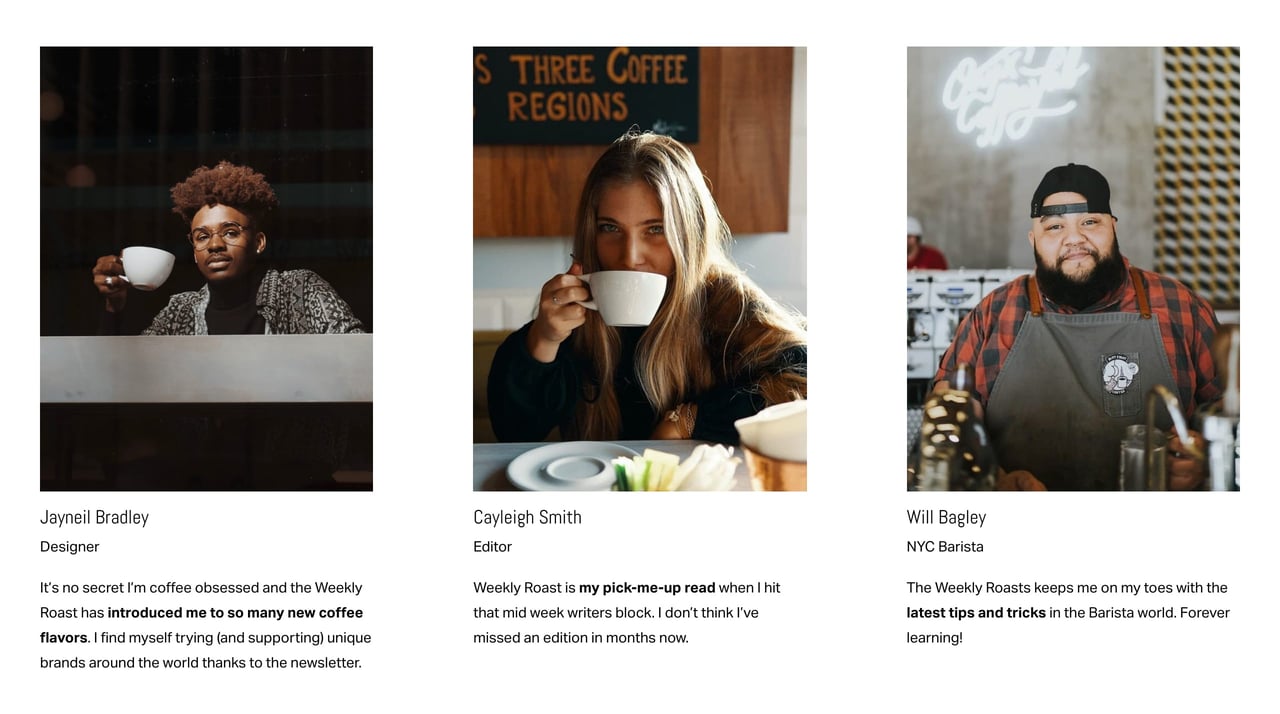
Here we can insert the Squarespace People section into the landing page:
Now edit the placeholder content with real subscribers providing value to potential subscribers. I’ve also hand-picked testimonials from a designer, an editor and a barista – all representing our target audience:
Note how I highlighted the main takeaways bold, for those visitors skimming our landing page.
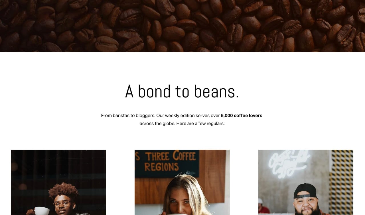
Taking into consideration the previous 3 tips, let’s strengthen the landing page further with a heading divider. It utilizes copy tailored to the audience (a bond to beans), social proof (5,000 subscriber count) and introduces our testimonials by highlighting their industries (editors, baristas):
This is really coming together!
5. Preview a send
Tip #05 is to link-to or embed a sample of a sent newsletter campaign. This will extinguish any doubts of poor quality and likely increase sign ups.
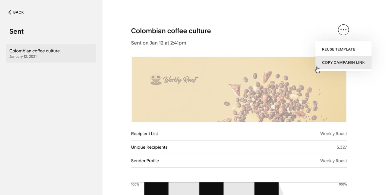
With Squarespace Email Marketing each send has a public campaign share link shown in your Sent campaigns:
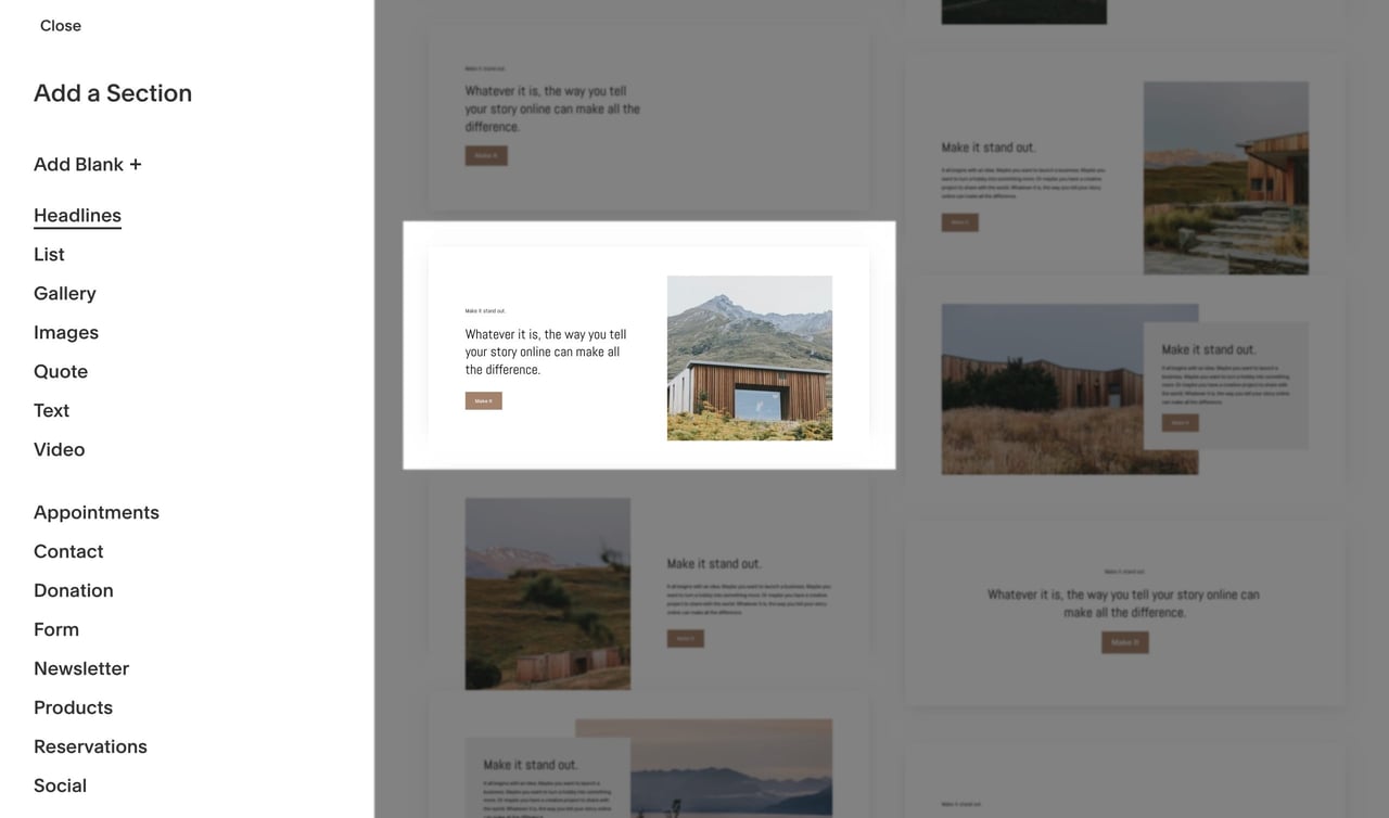
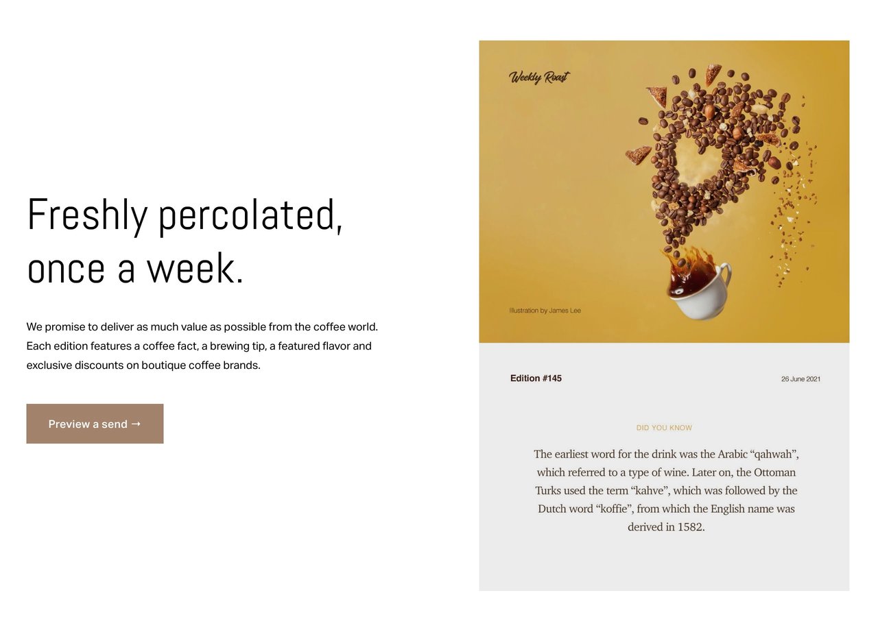
After I copied the above link, I inserted a Headlines section featuring an image to the right with clear alongside copy and a call-to-action button:
Note again the coffee slang used in the landing page copy. To the right is a screenshot of an edition that links to the sent campaign link. The call-to-action button also links to the same:
To strengthen the page even further let’s add a link to the sent campaign among the intro copy too:
If you are interested to learn more about Squarespace Email Campaigns, here is a 6 minute video tutorial I recently published.
Ok, our newsletter landing page has really shaped up but don’t forget one vital step before the big announcement:
Bonus: Test the mobile sign up
Taking into account Tip #01 – is your newsletter sign up form visible on mobile without needing to scroll? Let’s take a look using the useful Squarespace mobile/desktop viewer:
Brilliant.
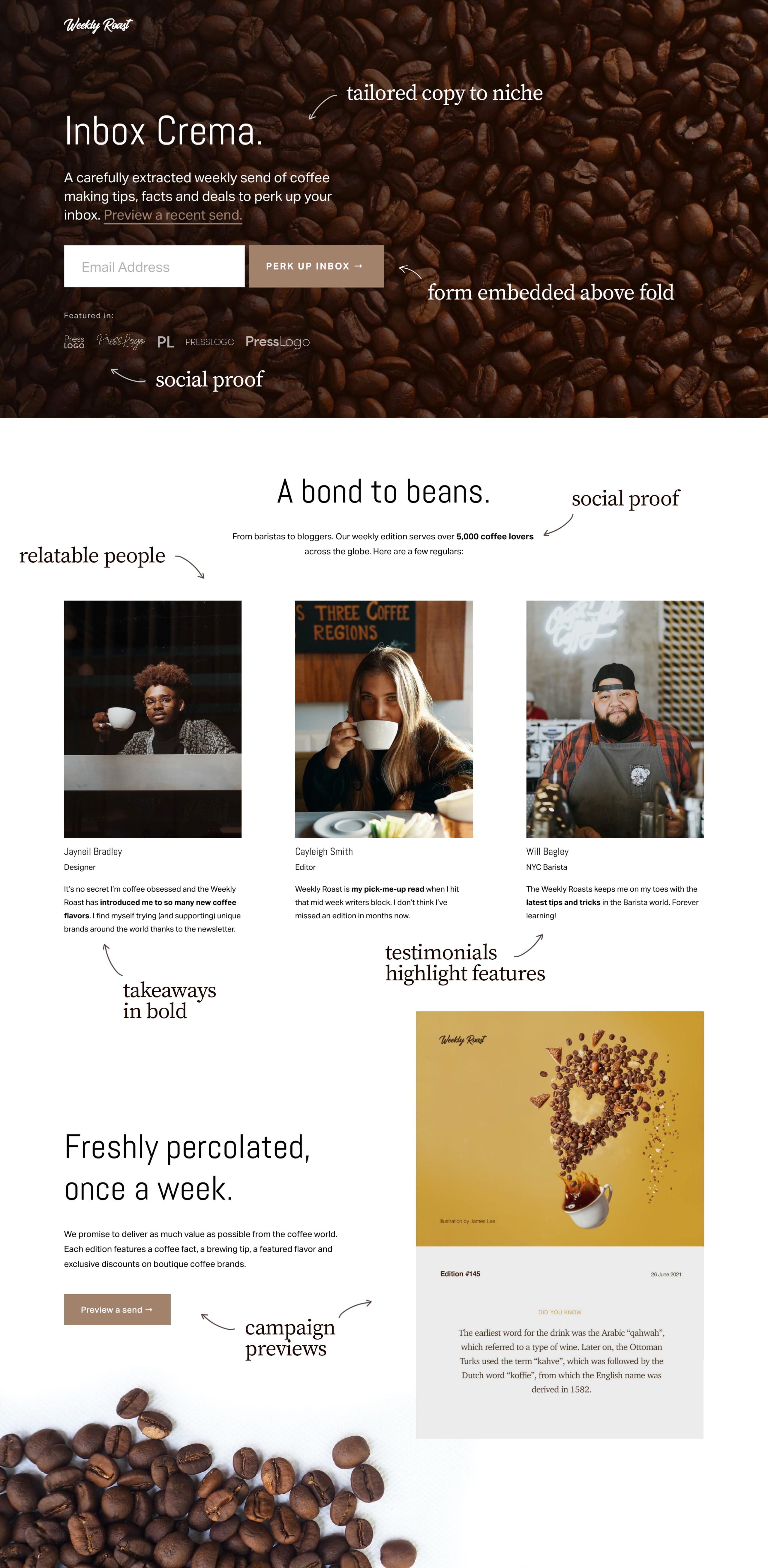
Let’s take a minute to reflect on the tips applied to our newsletter landing page, all built using Squarespace:
Coffee quote credit: BBC
Paid Newsletter Bonus: Add a clear pricing table
Once your newsletter numbers really start to take off, I’d strongly consider offering a premium-tier to your publication.
Think along the lines of exclusive content for the fans who want even more insight, tips or resources.
With Member Areas you can easily create members-only pages, which your visitors can access by creating an account and paying a membership fee. You can also use Email Campaigns to create a mailing list for your paid members and send exclusive content to their inboxes. Squarespace really is a good choice for an all-in-one platform to help grow your business and seamlessly manage public and members-only content all in one place.
At this point in your newsletter journey, you want to stipulate the differences between send frequency, types of content and price within your Landing Page.
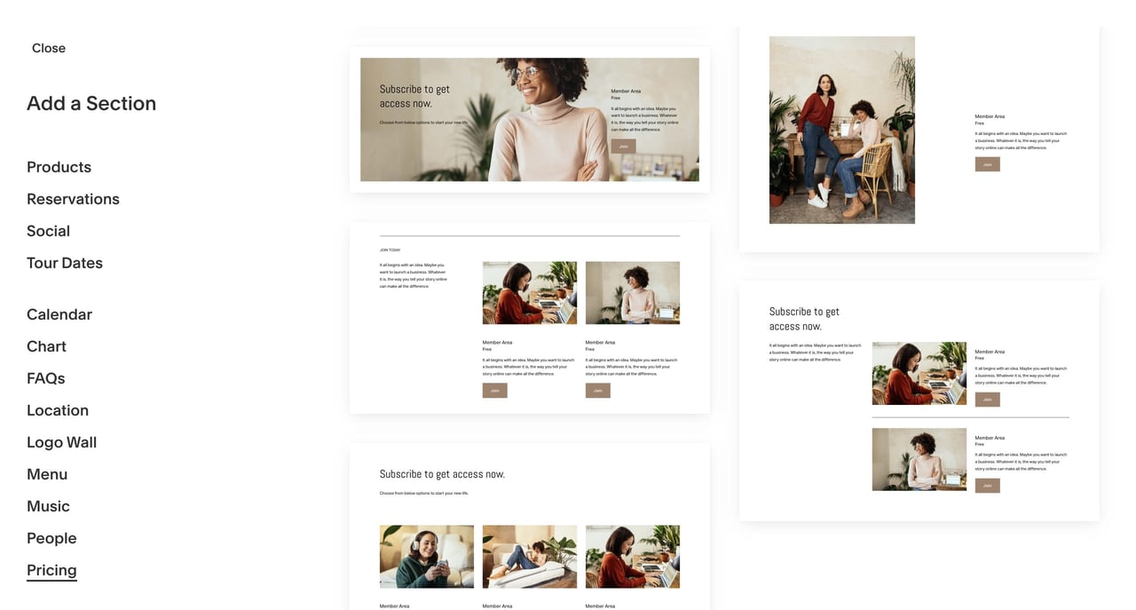
Squarespace has a wonderful set of vibrant Pricing page sections to chose from:
Learn more about how to start a premium newsletter with Squarespace.
FAQ: What are the benefits of using Squarespace?
Squarespace is a leading online website builder. What sets them apart is their superior level of design and award-winning customer support team available 24/7. Other main benefits are:
- No Website Hosting Needed - their platform is fast and secure.
- Online Content Management - all edits are done within your browser, no software needed.
- Easily Drag and Drop Images - unlimited galleries with unlimited bandwidth.
- Free Domain Name - when registering for your first website, if you pay annually (renews at standard rate).
- Beautifully Responsive - all templates work for all devices, so you only have to design your website once. Test and preview how your website will appear on a range of screen sizes.
- Blog Sections - can easily be added for content marketing and to share your journey.
- Commerce Solutions - are an upgrade away if you want to start selling products.
- Email Marketing - gather email addresses, send marketing emails and analyze the reader email activity.
- Member Areas - create private website sections only accessible to signed-up or paying members.
- Scheduling - add an online scheduler to your site to diversify your revenue with professional services or classes.
That’s a wrap! Don’t forget your 10% Off coupon*: OPL10
That’s a wrap! Don’t forget your 10% Off coupon: OPL10
I hope you enjoyed tips on how to increase your newsletter landing page sign ups! Props to Squarespace for creating a platform where we can spin up a strong landing page, with ease. In case you missed it, I recently published a tutorial on How to sell your first online course using Squarespace.
* The OPL10 coupon offer only applies to first payment of subscription on Squarespace, does not apply to future recurring payments or monthly plans, and may not be combined with any other offer codes or discounts.
Much love,
Rob
Twitter: @robhope
Email: [email protected]



![How to create a free link in Bio Site in minutes [video]](https://assets.onepagelove.com/cdn-cgi/image/width=420,height=222,fit=cover,gravity=top,format=jpg,quality=85/wp-content/uploads/2022/07/sqsp-thumb.jpg)
