

Alternatives to
← All typefaces
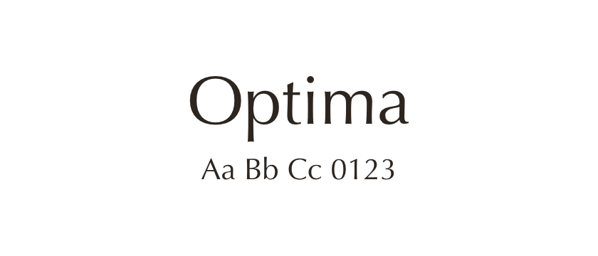
Optima
Optima has the structure and stroke modulation of a roman serif design without conventional serifs. Its broad capitals and tapered strokes give it a different texture from most sans serifs. Generous spacing is worth testing if you want to preserve that open character.
- Style
- Sans serif
- License
- Paid license ↗
- Designer / foundry
- Zapf Alphabets ↗