
Inter →
A flexible starting point for a website that needs a single family to cover several text sizes.
Open-source typefaces with real website examples, from practical sans serifs to expressive display faces.
Free is a licensing condition, not a visual style. This selection brings together open-source families with different jobs in a website: general reading, expressive headlines, editorial contrast and technical detail. The linked font pages point to their sources and licensing information.
Choose a working range before adding another family. Inter or Work Sans can be a useful first test for both titles and copy. Playfair Display and Instrument Serif offer stronger contrast for large text. Space Grotesk brings a distinctive sans-serif voice, while IBM Plex offers several related styles to explore.
Download or embed from the original distributor, and retain the license notices required by the particular font. Check language coverage, the weights you actually need, and performance on a mobile connection. Free does not mean every font works in every role: compare a paragraph, a short headline and a navigation label before committing.
A flexible starting point for a website that needs a single family to cover several text sizes.
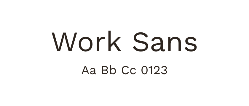
Compare its looser, more characterful shapes when Inter feels too neutral for the project.
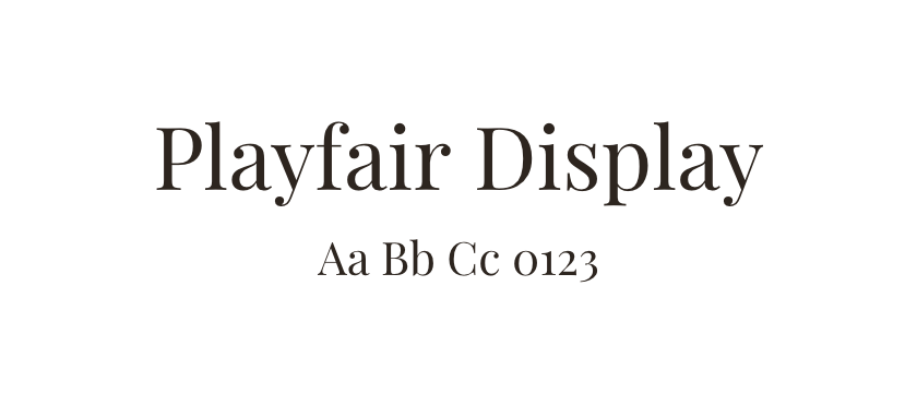
A high-contrast serif to test in prominent titles. Compare the thin strokes on a small screen rather than judging a large specimen alone.
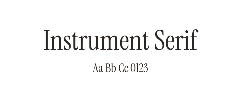
An expressive option for short headlines and editorial accents; test it with restrained body copy.
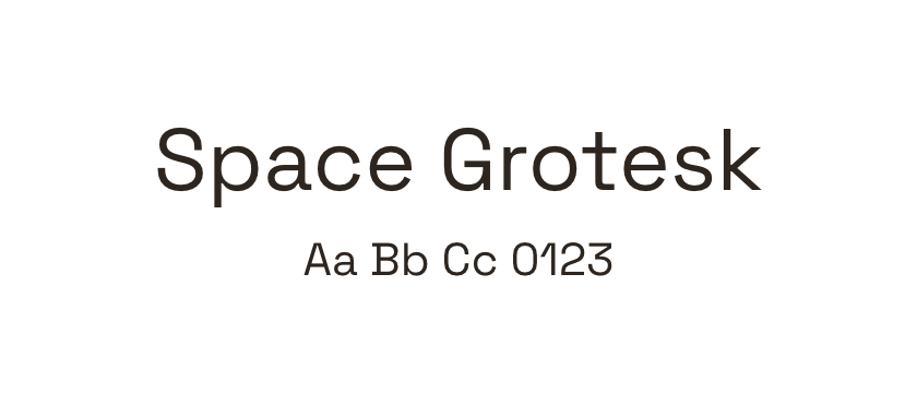
A sans-serif option with more noticeable details. Check whether its character supports the brand across repeated headings.
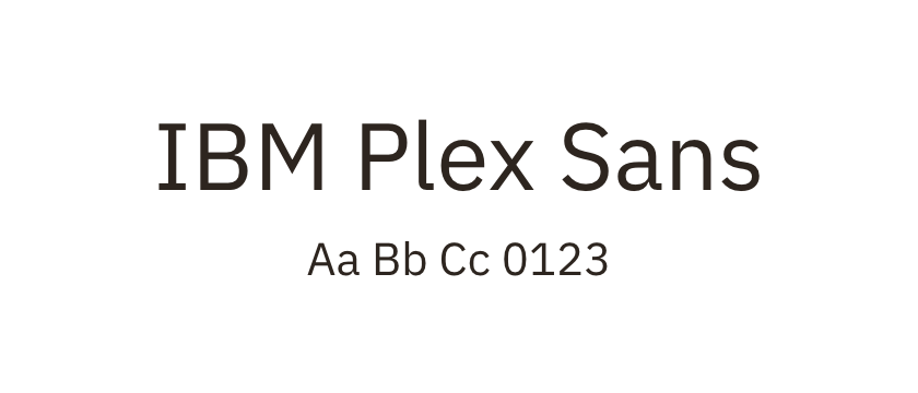
A related collection of sans, serif and mono styles. Confirm the specific subfamily and files you intend to use.


