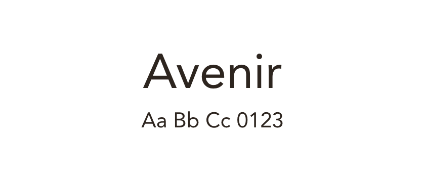
Avenir →
The reference family. Compare its circular forms and the rhythm of your existing text before choosing an alternative.
Compare Lato, Manrope and DM Sans with Avenir for a new website or a considered font replacement.
Avenir combines a geometric starting point with softer text forms. When choosing an open-source alternative, decide whether you want to keep the circular character, the warmth, or the way a paragraph sits on the page. No single alternative preserves all three exactly.
Lato is worth testing when warmth and reading are the priority. Manrope moves toward a more geometric visual direction. DM Sans offers another practical comparison for short landing-page copy and navigation. Treat these as alternative design routes rather than equivalent versions of Avenir.
Start with your longest headline and a representative paragraph. Compare line breaks, apparent weight and numeral widths at desktop and mobile sizes. A change of typeface can require changes to spacing and layout as well. The linked detail pages include specimens and actual website examples, with separate links to the font sources and available licensing information.
The reference family. Compare its circular forms and the rhythm of your existing text before choosing an alternative.
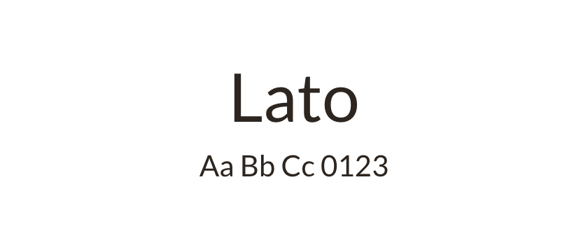
A warmer text direction that can suit a similar range of website tasks while looking noticeably different.
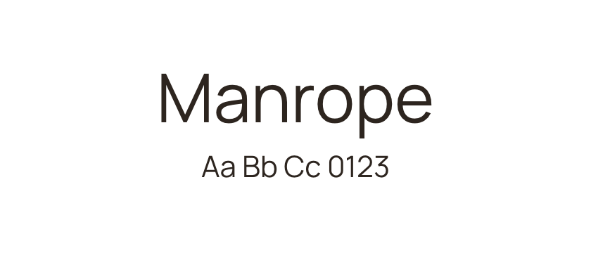
A geometric alternative to test when circular forms and concise headings matter most. Do not expect identical spacing.
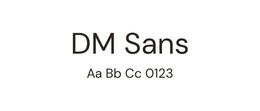
A practical option for short website text and navigation. Compare individual lowercase shapes and line breaks rather than relying on a broad visual resemblance.


