Inter →
Suggested role: supporting copy and navigation. Keep the hierarchy clear with a restrained range of sizes and weights.
A quiet sans serif meets an expressive serif. Explore the specimens and websites that use both.
This combination offers a clear change of voice without asking both fonts to compete for attention. As an editorial starting point, try Instrument Serif for a short opening statement and Inter for supporting text, navigation and practical details. That is a suggested arrangement, not a claim about every featured website.
The contrast is most useful when there is a clear difference in role. Keep the serif passages short enough to feel deliberate, and use scale and whitespace to connect them to the surrounding copy. If every section switches voices, the distinction can become distracting.
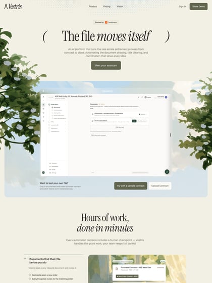
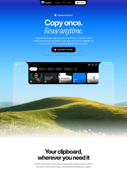
Test your longest headline at a mobile width, then compare a paragraph of Inter at the intended reading size. Both families have open-source options from their original distributors; confirm the files and license you use. The examples below are selected from published font credits and let you inspect the designers' own choices of size, weight and placement.
Suggested role: supporting copy and navigation. Keep the hierarchy clear with a restrained range of sizes and weights.
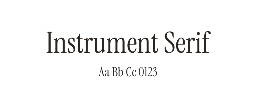
Suggested role: an expressive title or a short editorial accent. Give the distinctive shapes room, and test thin details on mobile.
These websites credit both typefaces. Inspect each design for its own choice of roles, weights and spacing.