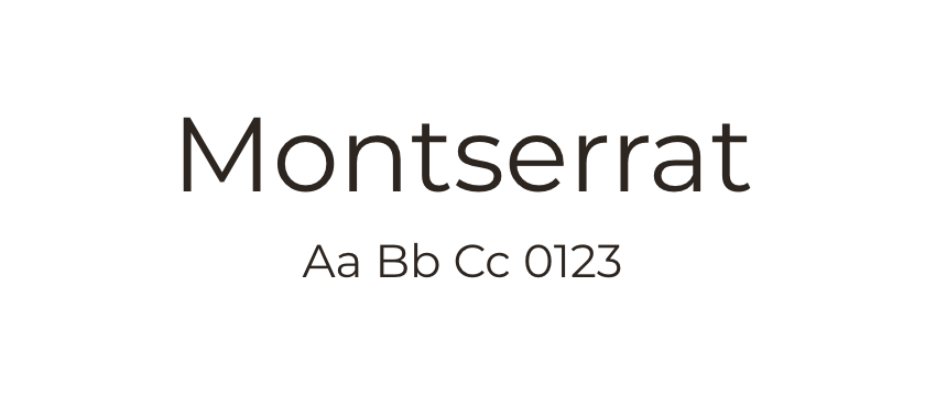
Montserrat →
Suggested role: short headings. Compare the width of longer titles at mobile sizes before settling on a weight.
A geometric headline direction with a more humanist text companion. See real websites using the combination.
Montserrat and Open Sans offer a straightforward way to create hierarchy through a change of typeface. Try Montserrat for short, confident headings and Open Sans for explanatory paragraphs. This is an editorial suggestion; the featured websites may distribute the roles differently.
Because both families are sans serifs, the distinction can be subtler than a serif-and-sans pairing. Let size and weight do some of the work. Keep the body text comfortable and avoid introducing multiple nearly identical weights that make the hierarchy harder to read.
Start by comparing the two families in your actual headline and body copy. Check whether the second family earns its place or whether one could do both jobs. Both are available through Google Fonts; consult the linked sources for their licenses and supported languages. The examples below all credit both typefaces, so you can see how the combination behaves beyond a specimen.
Suggested role: short headings. Compare the width of longer titles at mobile sizes before settling on a weight.
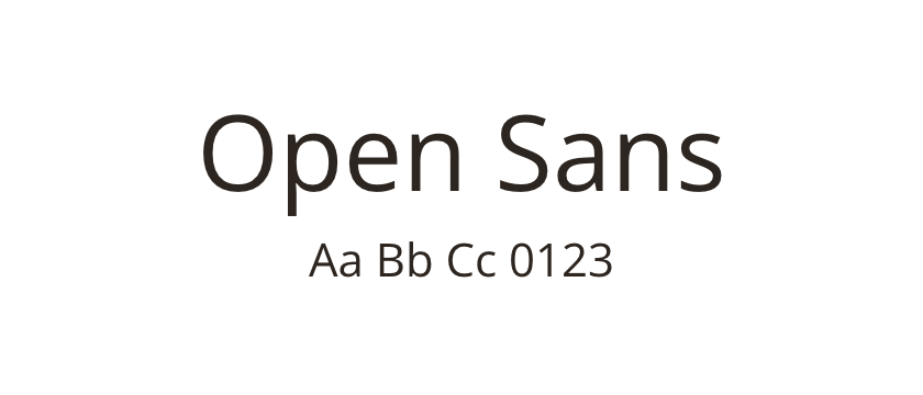
Suggested role: supporting paragraphs and practical details. Test the body size independently so it balances the headline rather than merely matching its number.
These websites credit both typefaces. Inspect each design for its own choice of roles, weights and spacing.




