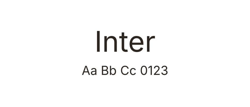
Inter →
A restrained starting point when the imagery or projects should set the tone. Compare regular text and bold project titles before adding a second family.
A shortlist for portfolios that need to frame the work, express a point of view, or do a little of both.
Start with the work you want people to notice. A photograph-heavy portfolio often benefits from quiet typography; a writer or type designer can let the lettering carry more of the identity. These are editorial starting points, with specimens and actual website examples to help you decide.
For a restrained direction, compare Inter and Neue Montreal. For a warmer geometric voice, look at Circular. Editorial New and Instrument Serif create a more pronounced contrast with understated navigation and project captions. Space Grotesk adds character without switching to a serif.
Test the longest project title and a short case-study paragraph before choosing. A font that looks good in a two-word hero can wrap awkwardly in project cards. Keep navigation and captions readable, then use size and weight to create hierarchy. Open each typeface to see it in context and check the source for web licensing.
A restrained starting point when the imagery or projects should set the tone. Compare regular text and bold project titles before adding a second family.
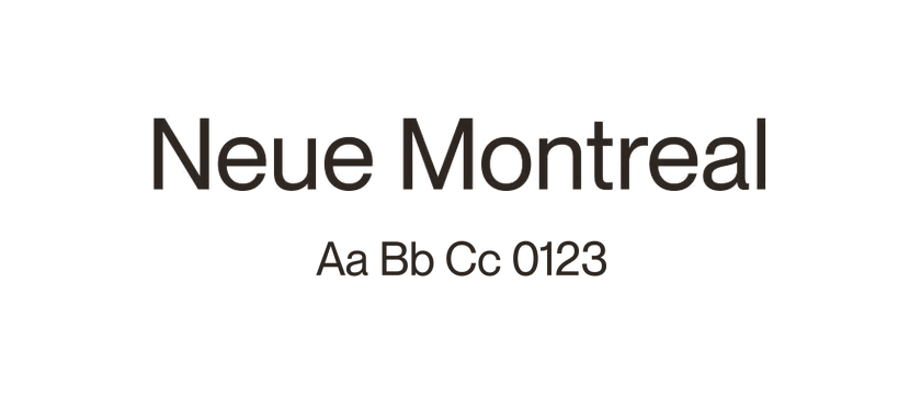
A compact grotesque direction for portfolios with large titles and carefully spaced navigation. Use the website examples to judge how much personality the layout adds.
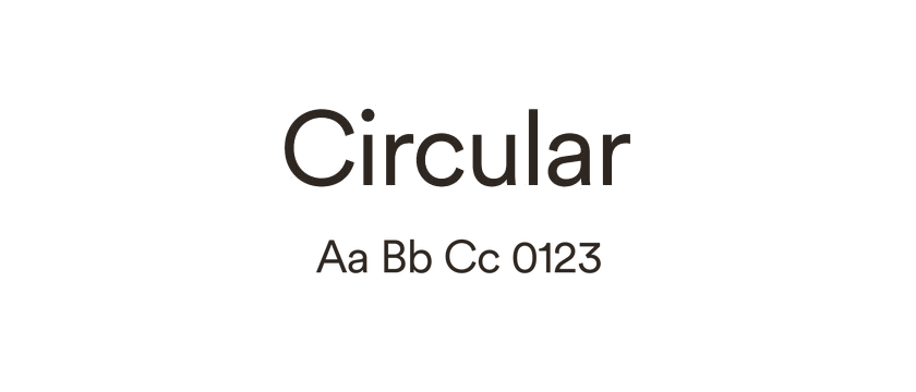
Rounded geometric forms offer a softer direction. Compare the lowercase shapes with Inter rather than choosing by the capital letters alone.
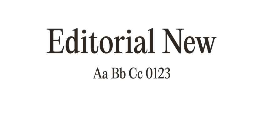
Consider this serif for expressive project titles. Keep small captions quieter and test the thin details at the actual size you plan to use.
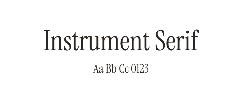
An expressive serif option for a concise introduction or selected quotation. Pair it with straightforward small text so the page remains easy to scan.
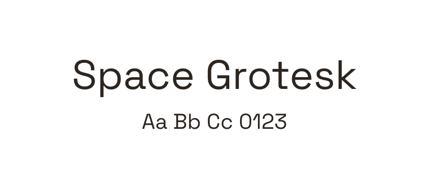
Distinctive details give a portfolio more voice while retaining a sans-serif structure. Useful to compare when a neutral grotesque feels too anonymous.


