
Inter →
Compare it for a system spanning headings, navigation and explanatory paragraphs. Its large lowercase forms make small text worth testing alongside the hero.
Compare typefaces for product headlines, explanatory text, pricing tables and the small details of a SaaS landing page.
A SaaS landing page asks its typography to do several jobs. The headline needs to explain the product, the body needs to support a quick scan, and pricing or feature tables need to stay legible. Start by testing those three contexts with one family.
Inter, Geist and Source Sans offer different approaches to that everyday range. Manrope has a more geometric feel, while DM Sans is another direction to compare for short product copy. A monospace companion such as Roboto Mono can distinguish a code sample or a technical label, but using it everywhere will change the rhythm and width of the text.
Compare your real product name, prices, punctuation and longest button label. Check that the weights you need are included in the web license and that the font supports your languages. The specimens below are a starting point; open the linked examples to see how designers balance typography with product imagery.
Compare it for a system spanning headings, navigation and explanatory paragraphs. Its large lowercase forms make small text worth testing alongside the hero.

A useful candidate for concise product headings and interface-like details. Compare its spacing with Inter at your actual text sizes.
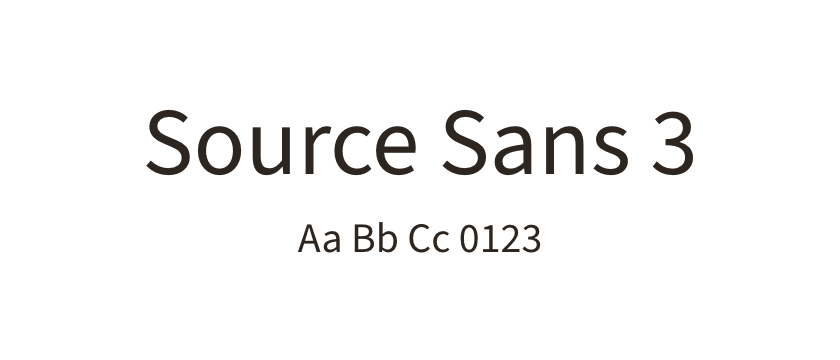
A more humanist direction for product explanations. Try a paragraph and feature list before deciding how much heading contrast you need.

A geometric option that can make a short product statement feel more distinctive. Test numerals and punctuation in a realistic pricing block.

A compact shortlist candidate for landing pages built around short passages and clear hierarchy. Compare its regular and medium weights.

Consider it for code or a small set of technical labels. Keep the main explanatory copy in a proportional family unless the monospaced rhythm is intentional.


