Neue Montreal →
Suggested role: navigation, captions and supporting text. Use its quieter structure to make the more expressive moments feel intentional.
Two contrasting voices for editorial portfolios and expressive landing pages, with examples from real websites.
The appeal of this pairing is the difference between a straightforward grotesque and an expressive serif. As a starting point, try Neue Montreal for the repeated parts of a page and Editorial New for a selective change of voice. You can also reverse the emphasis if the project is led by editorial text.
Give each family a clear purpose. Project captions and navigation can form a consistent layer while a title or quotation carries more personality. Pay attention to apparent size: equal CSS font sizes do not guarantee that two families feel equally prominent.
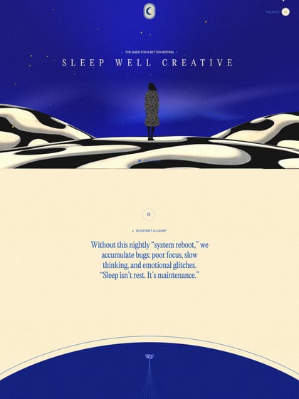
The websites below credit both fonts, but our data does not assign their heading or body roles. Open the full designs to inspect those decisions. Before building, review the web licenses for both families; trial availability is not a substitute for permission to publish the fonts on a website.
Suggested role: navigation, captions and supporting text. Use its quieter structure to make the more expressive moments feel intentional.
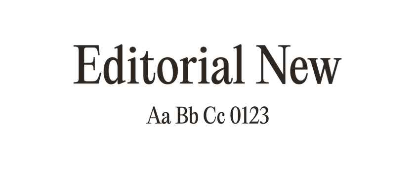
Suggested role: prominent titles or selective editorial passages. Compare weights and italics carefully so the contrast does not become overly busy.
These websites credit both typefaces. Inspect each design for its own choice of roles, weights and spacing.