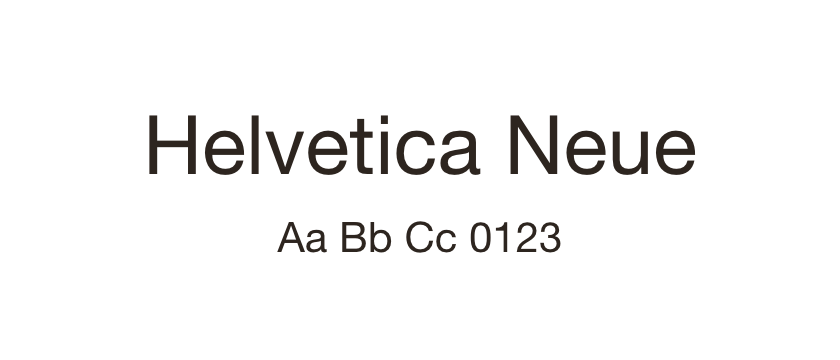
Helvetica Neue →
The reference family. Compare the lowercase and spacing in your existing design before judging replacements.
Compare Inter, Roboto and Work Sans with Helvetica Neue. Similar roles, different letterforms and spacing.
Replacing Helvetica Neue is rarely a matter of swapping a font-family name. The alternatives below can fill a similar role in a restrained website, but they are independent designs. Their proportions, spacing and line breaks will differ, so none should be treated as a drop-in substitute.
Inter is the first comparison for a contemporary screen-focused direction. Roboto offers another broad sans-serif family with a different rhythm in the lowercase. Work Sans is more visibly characterful and may suit a redesign where retaining the exact original tone is less important.
Set the same headline, paragraph and navigation labels in both fonts before switching. Check wrapping at mobile widths and inspect the numerals in prices or dates. Revisit font size, line height and tracking rather than forcing the replacement to mimic the original. The comparison here is editorial; the linked source pages provide the actual license terms.
The reference family. Compare the lowercase and spacing in your existing design before judging replacements.
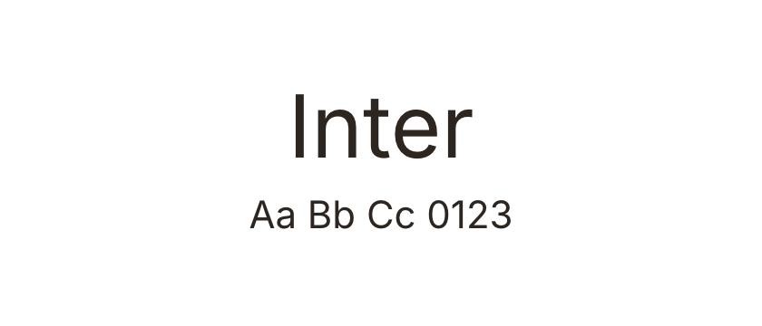
Consider for a similar neutral role, with a different screen-oriented character. Expect changes to line length and the apparent size of the lowercase.
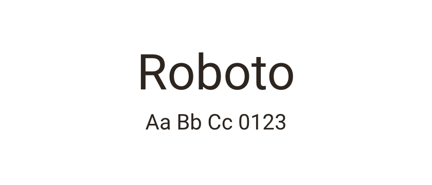
Another open-source sans-serif direction for general website text. Its letter shapes are not identical, so test it as a design choice rather than a metric match.
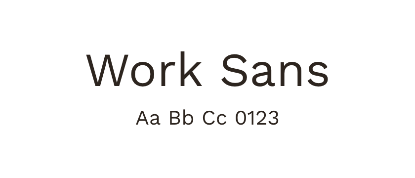
A more characterful alternative for a fresh interpretation. Choose it when maintaining neutrality matters less than giving the page a slightly different voice.


