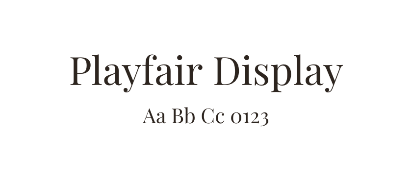
Playfair Display →
Compare for an editorial title with clear contrast between thick and thin strokes.
Compare serif directions for editorial titles, longer reading and expressive one-page designs.
Serifs can change the tone of a website without changing the layout. The useful distinction is often between a face intended for attention-grabbing titles and one that remains comfortable across several paragraphs. Test both contexts instead of treating all serifs as interchangeable.
Playfair Display and Editorial New offer pronounced contrast for prominent text. Instrument Serif is another expressive direction. Merriweather and Source Serif are worth comparing in longer reading passages, while Adelle adds a sturdier slab-serif option. These are editorial suggestions, not a ranking of universal readability.
Use your real content at the intended size and line length. Look at the thin strokes on a phone, the density of a paragraph, and the relationship between italics and upright text. A serif can provide all the hierarchy you need, or it can work with a quieter sans serif; follow the font detail pages to see combinations already used on websites.
Compare for an editorial title with clear contrast between thick and thin strokes.
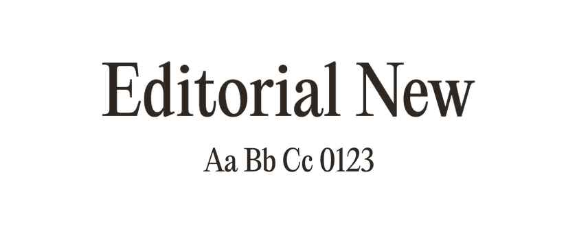
A more expressive direction for prominent headlines or a strong opening statement.
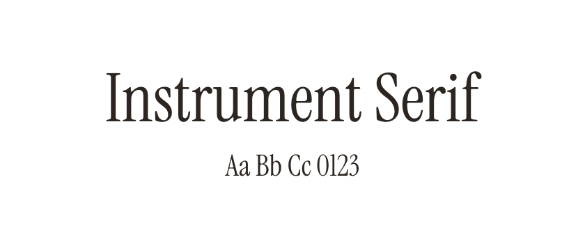
A characterful option for short passages and oversized titles. Test smaller text separately.
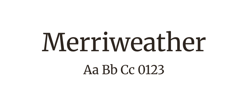
A sturdy reading candidate. Compare paragraph texture and line breaks with the other serifs.
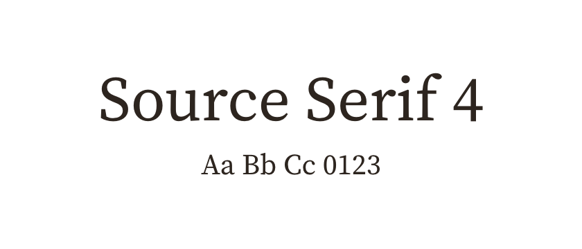
A useful reading-oriented comparison alongside Merriweather. Check which version and optical-size files the source supplies.
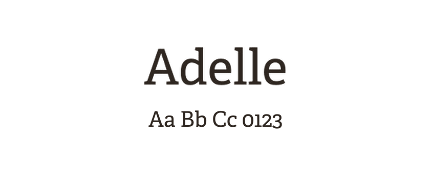
A slab-serif direction when delicate contrast does not suit the project. Its weight changes the tone of a title considerably.


