← All typefaces
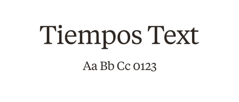
Tiempos
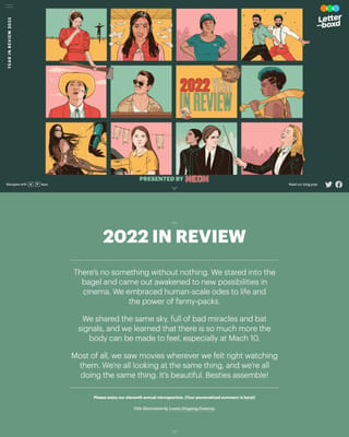
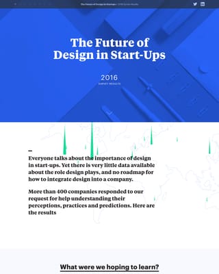
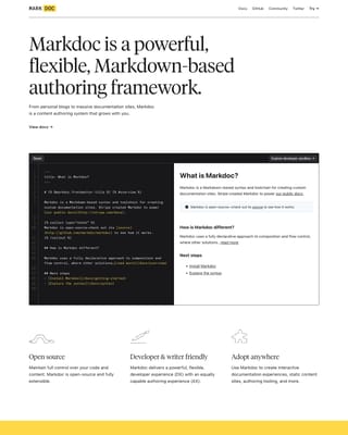
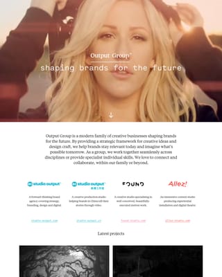
Tiempos separates editorial typography into Text, Headline and Fine families. Text favors economical reading; Headline is made for larger settings; Fine sharpens the contrast further. Choose the optical direction before comparing weights, especially for a page with long introductions.
- Style
- Serif
- License
- Paid license
- Designer / foundry
- Klim Type Foundry ↗
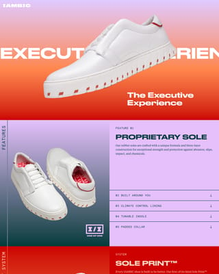
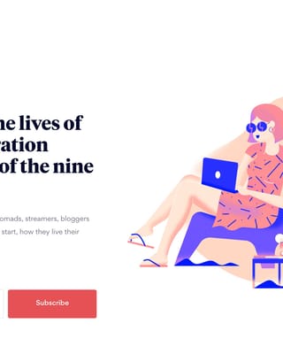
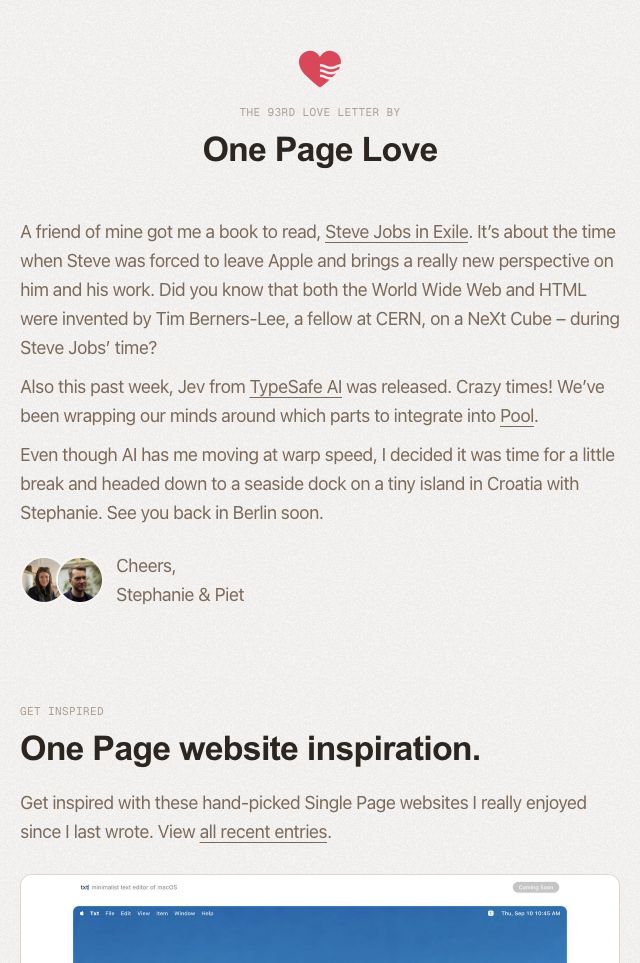
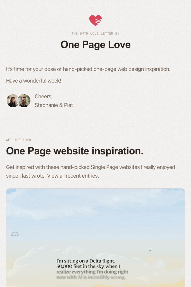
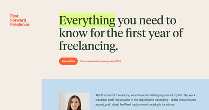
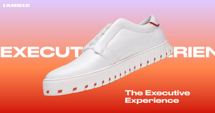
Websites using Tiempos


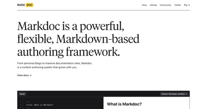
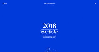
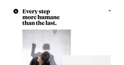

Tiempos font pairings
Used together in our collection. Open the examples to see how each design combines them; font credits do not specify which font is used for headings or body text.