← All typefaces
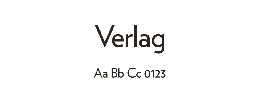
Verlag
Verlag began as a commission for the Guggenheim Museum, drawing on geometric typography and the building’s lettering. Small lowercase forms and tall ascenders give it an early-modernist character. Its normal, condensed and compressed widths provide different ways to organize a headline.
- Style
- Sans serif
- License
- Paid license
- Designer / foundry
- Hoefler & Co. ↗
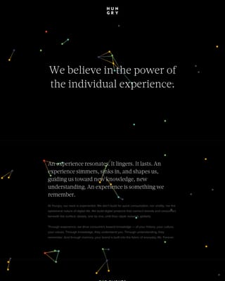
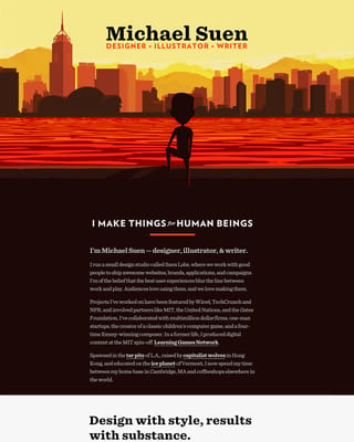
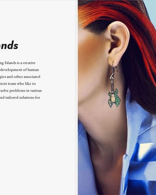
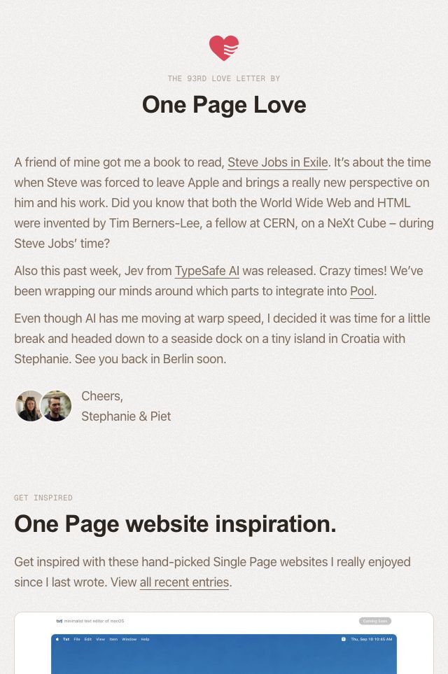
Websites using Verlag


Verlag font pairings
Used together in our collection. Open the examples to see how each design combines them; font credits do not specify which font is used for headings or body text.