The Top 70 One Pagers from 2012.
2012 was an incredible year for the One Page website and 2013 looks even better! Here are the best One Page Websites we featured last year in our Most Loved category. There is no ranking order but is divided up into categories for better inspiration:)
Hope you enjoy the roundup, be a legend and share the post with your friends if you found it useful!
Best One Page Event Websites in 2012
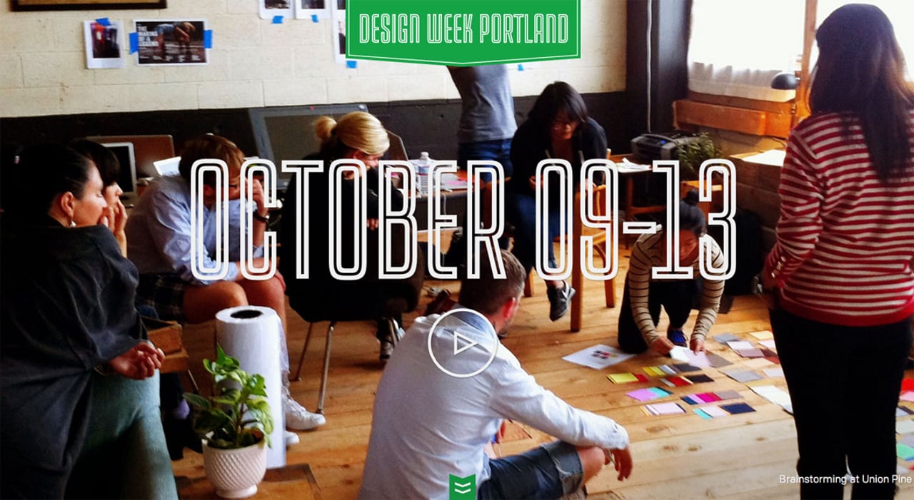
Design Week Portland
At first I didn’t consider the site “Most Loved” worthy but when you dive deeper there is definitely loads love in here. The responsive works well and I like how the big numbers are a selectable web font. Also there is actually a ton of info in this site but considerately hidden by accordions, really useful when skimming sessions. Lastly the “party mode” scheme switcher bottom right is a nice touch:)
Inspire Conference 2012
Simply stunning design, color scheme and illustrations for an upcoming conference held in The Netherlands. LOVE how the speakers are featured in the rings of tree stumps. The overall consistency of the concept is world class. Top job.
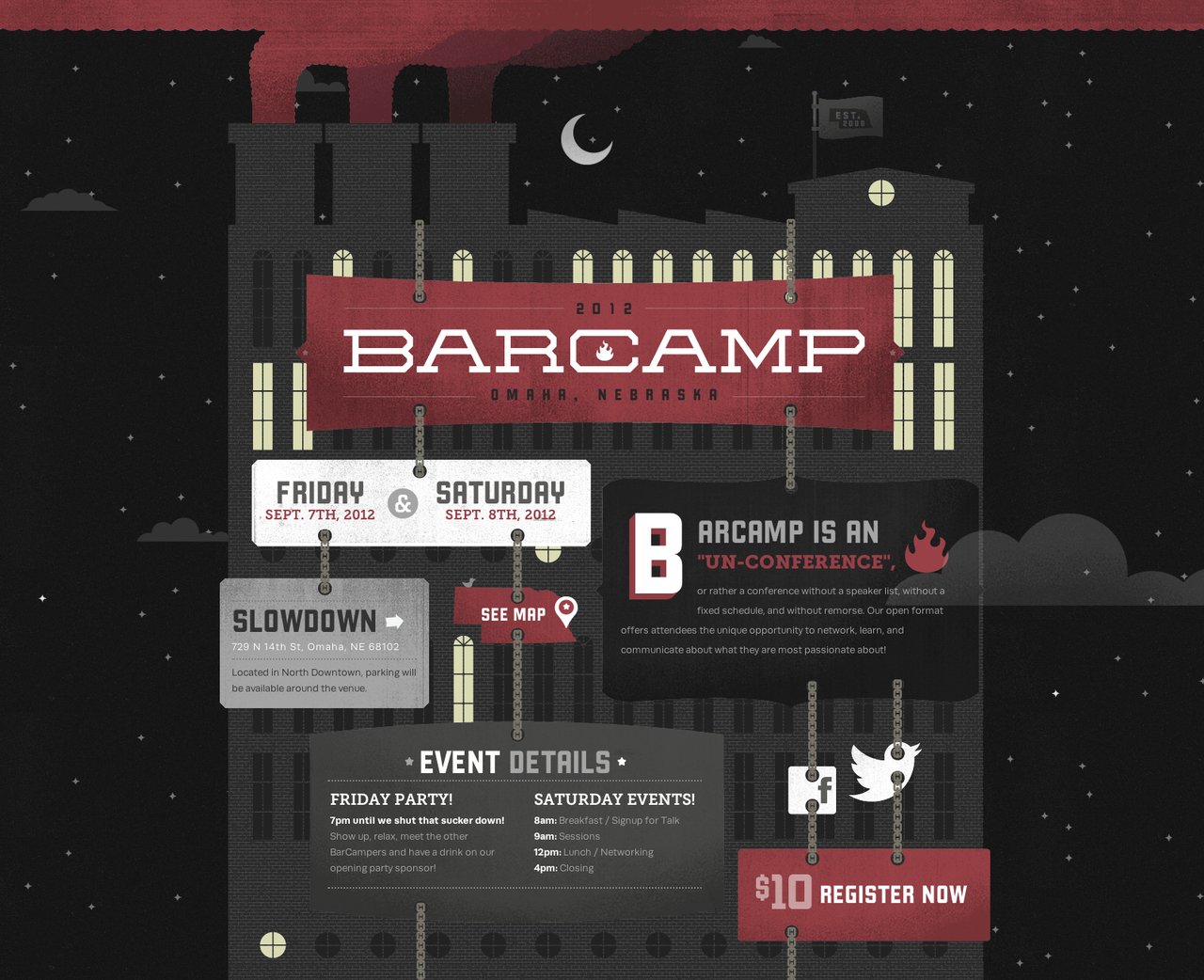
Barcamp Omaha 2012
Such great work on the illustrations, the animations and parallax scrolling with the clouds. Check out our interview with Creative Director, Michael DeKay, where we talk about the build.
Jess & Russ
Its hard to put in words the awesomeness of this wedding site, you really need to experience the parallax scrolling and illustrations yourself. Can imagine this site took months to build and so worth the result.
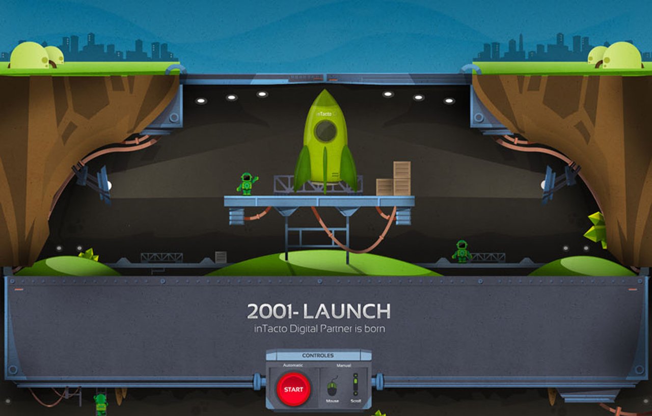
inTacto 10 years
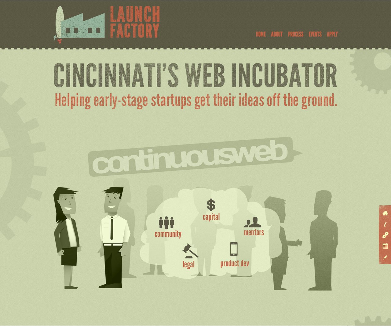
Launch Factory
Best One Page iPhone App Websites in 2012
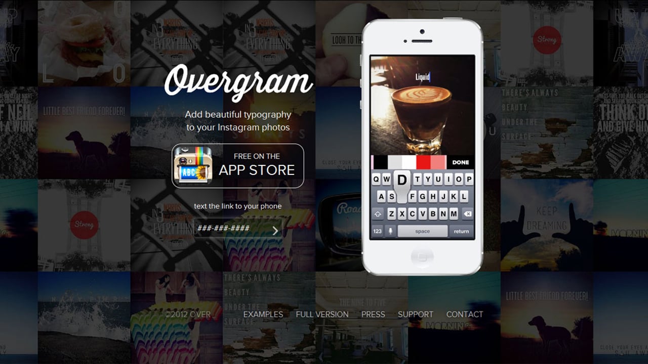
Overgram
Loving this One Pager for the (free) Overgram iPhone app. It has such a good demo, you just have to sit and watch the iPhone whilst the browser background also previews examples. Brilliant.
Daybreak 2012
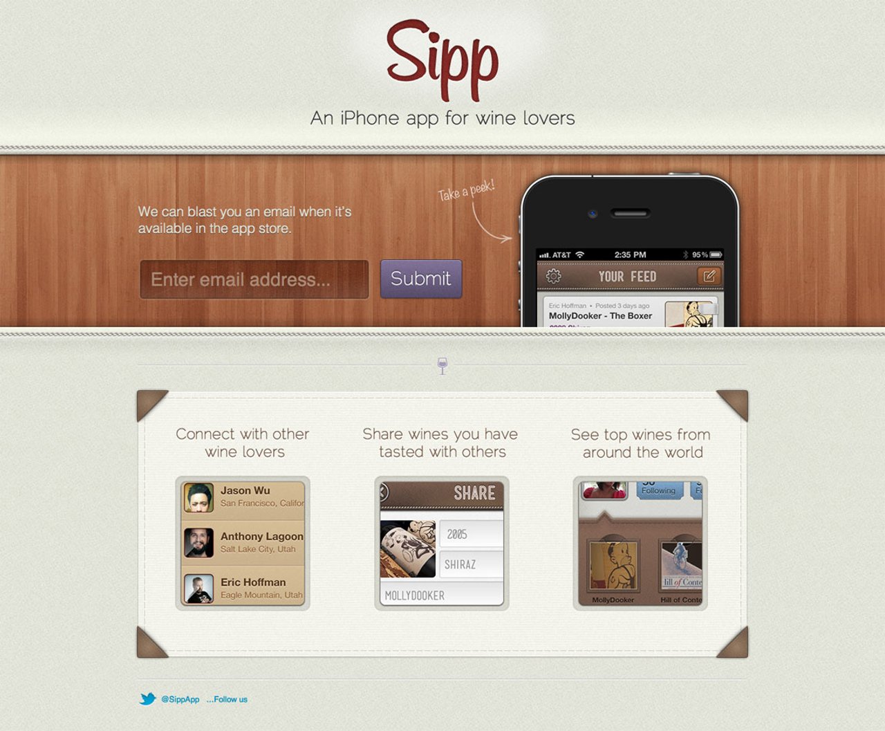
Sipp
The textures, wood, colors... what a beautiful One Pager to preview an iPhone app. Also love the animation when hovering over the phone.
Best One Page Portfolio Websites in 2012
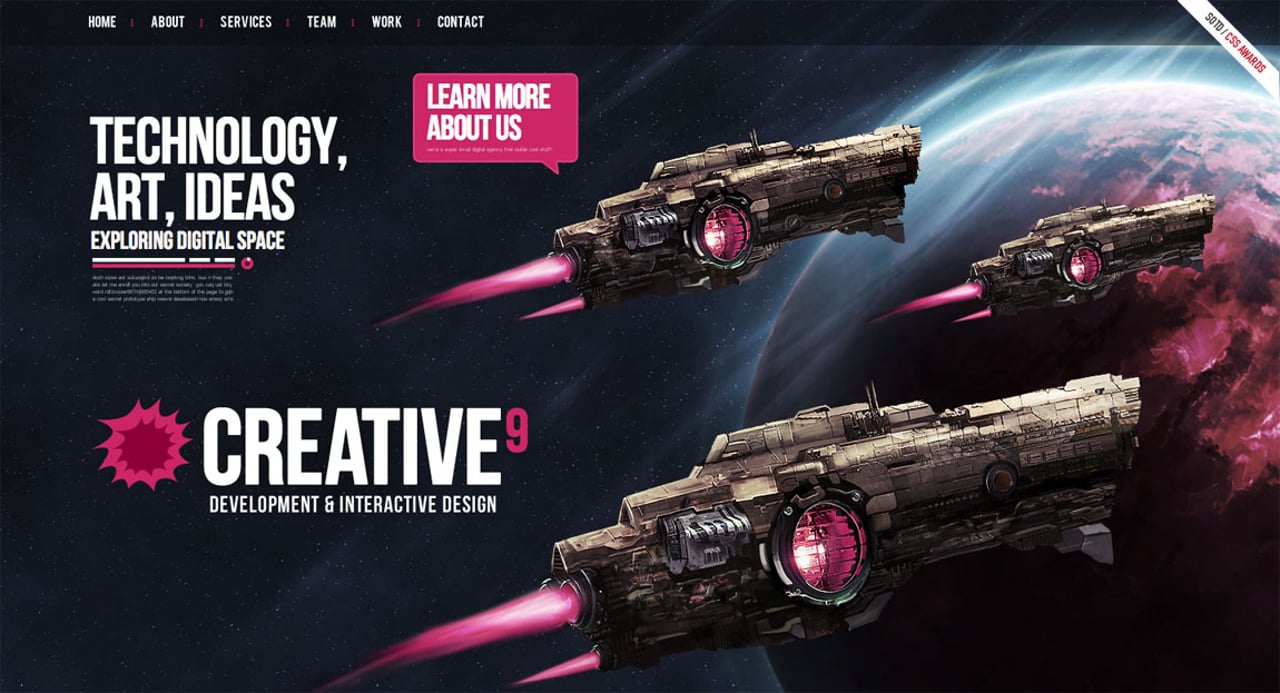
Creative9
Slick preloader. Floating spaceships. Solid color scheme. All kinds of awesome in here.
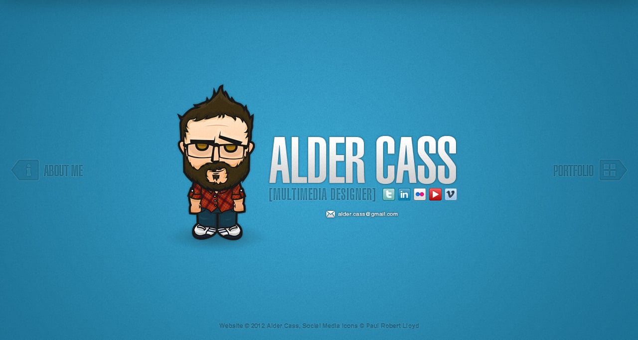
Alder Cass
It features loads of color, full screen slick transitions and lovely hover effects. I catch up with Alder where we rap about the build, his work setup and the death of Flash.
Always Creative
Big images, full screen slide transitions, parallax scrolling and a slick minimalistic design... within seconds I could tell the site would be in the "Most Loved" category. Catch our interview with Creative Director, Roby Fitzhenry, here.
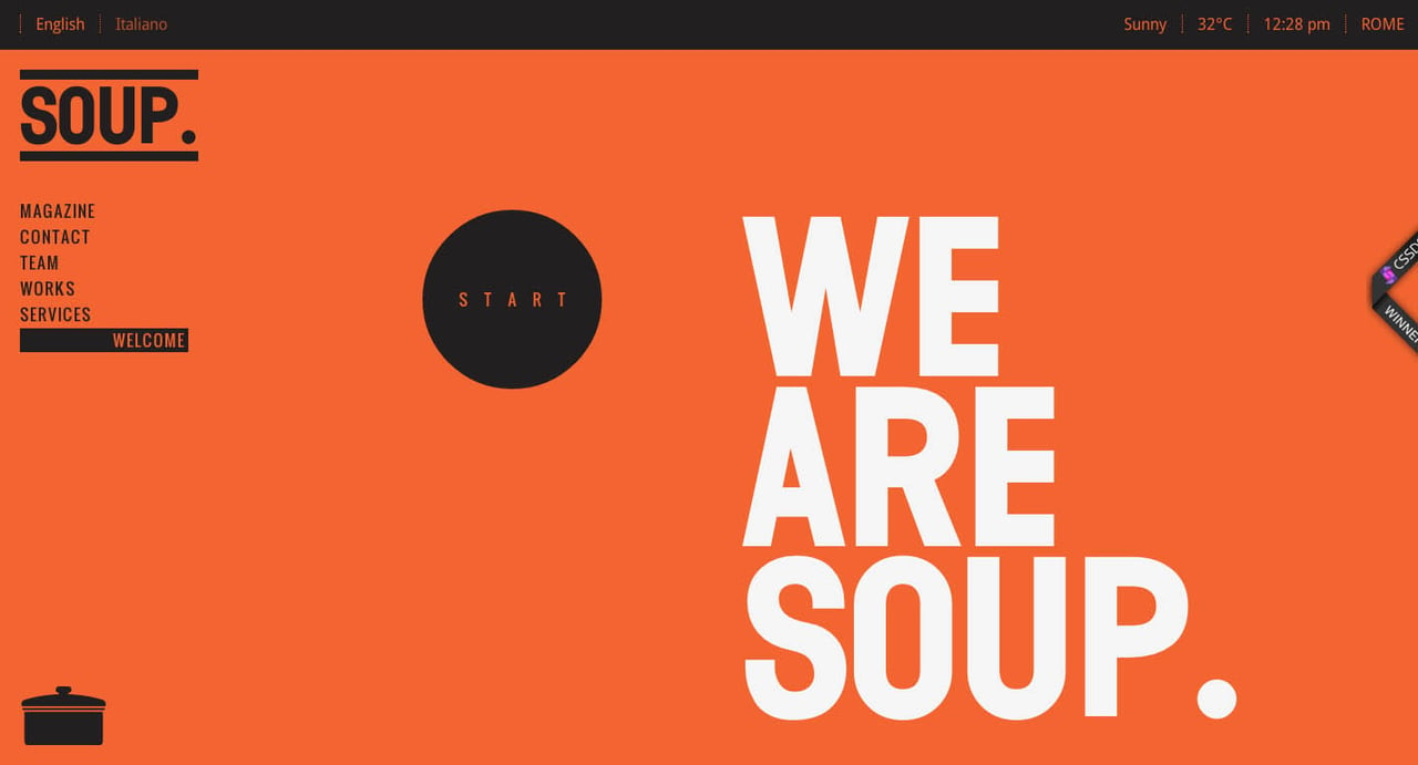
SOUP. Agency
Loving the hover effect on the SOUP. team infographic, also a great looking One Pager!
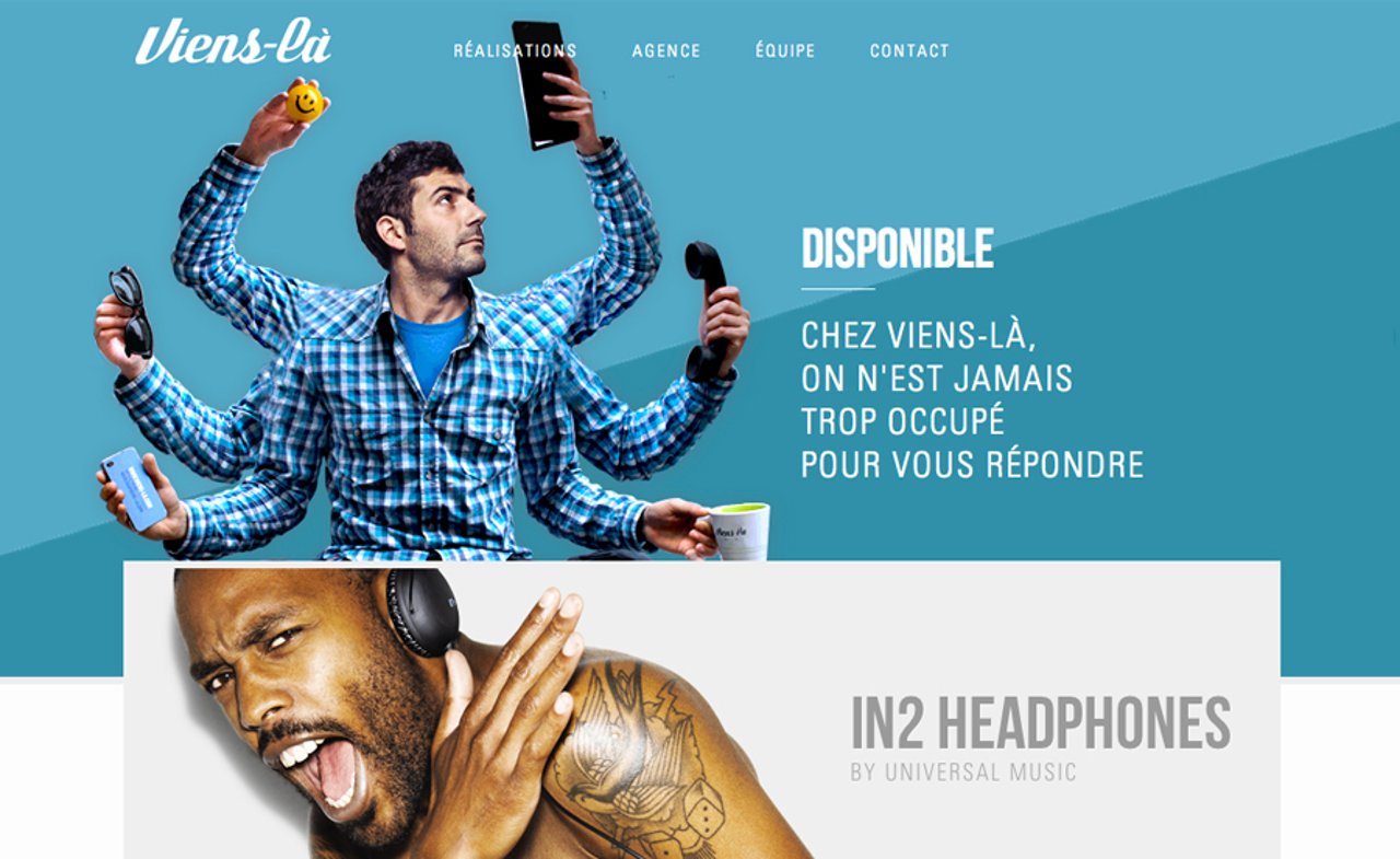
Viens-là
5 years ago this website would definitely have been flash, its great to see what is being done nowadays with loads of skill and thought. Big images, keyboard navigation, color, illustrations... all well executed.
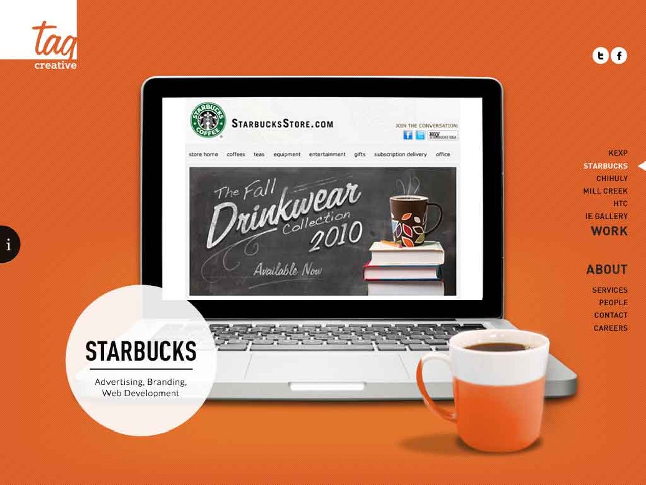
Tag Creative
You can't go wrong with super crisp big images, loads of color and some Parallax Scrolling! Nom nom...
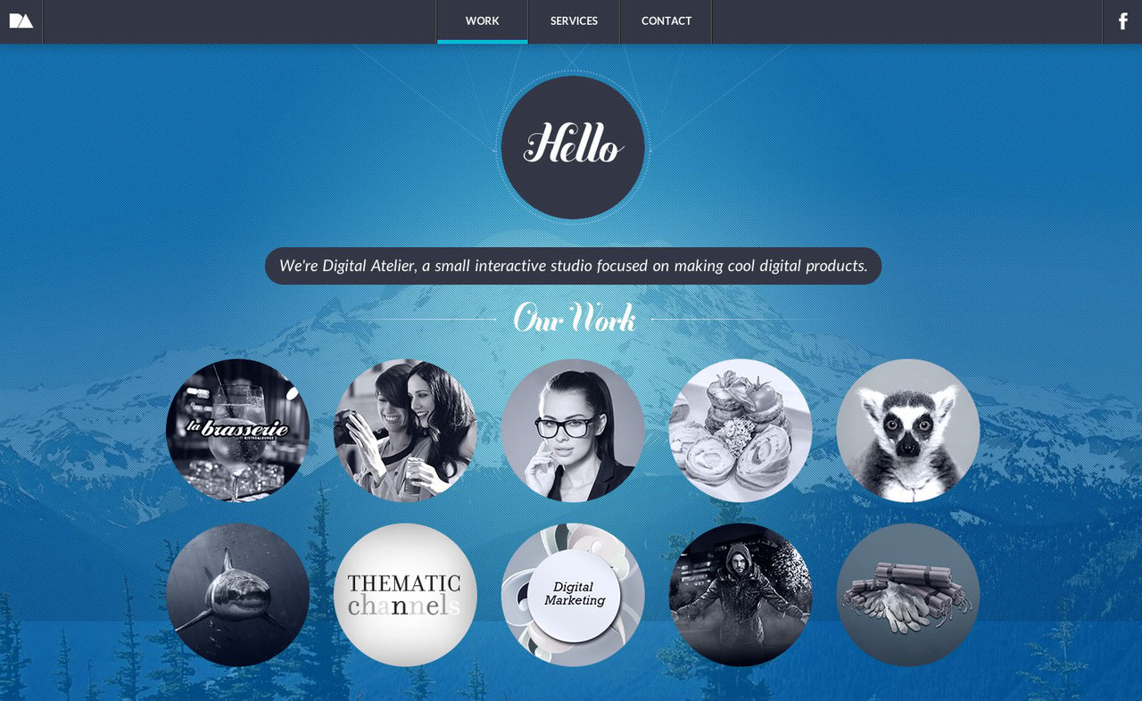
Digital Atelier
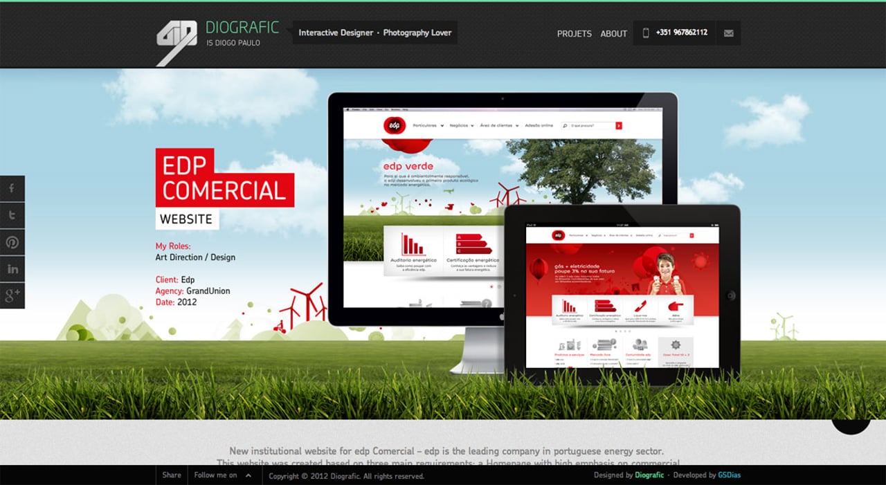
Diografic
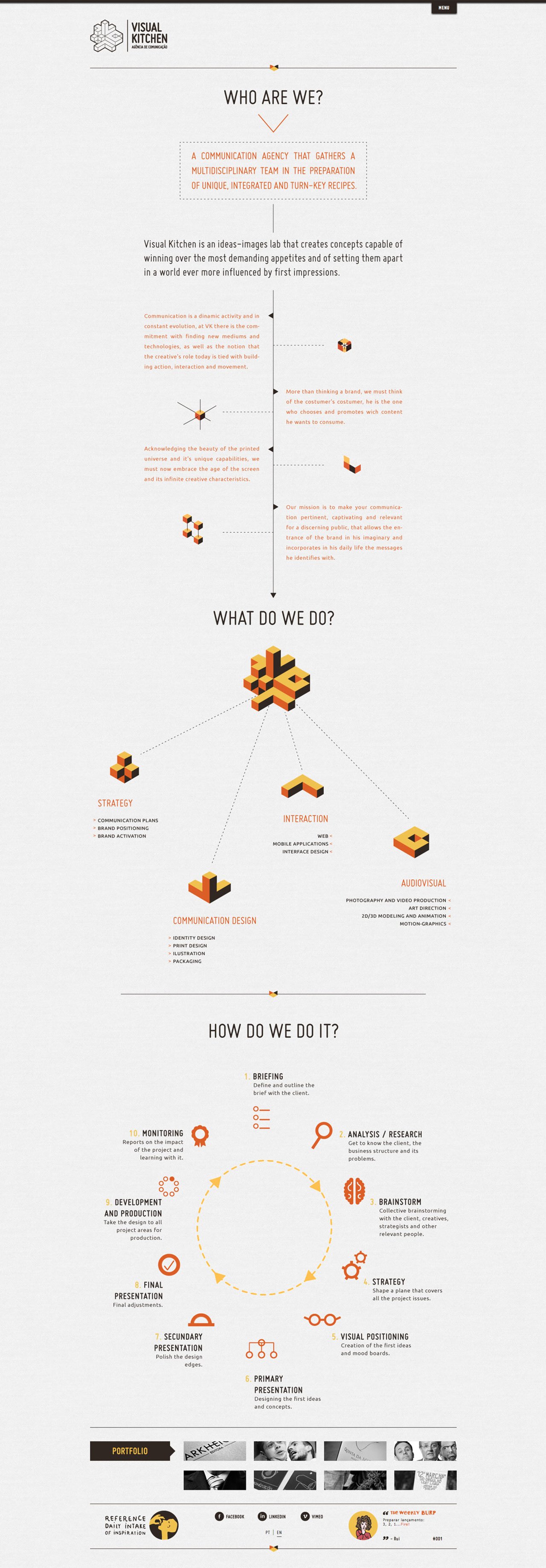
Visual Kitchen
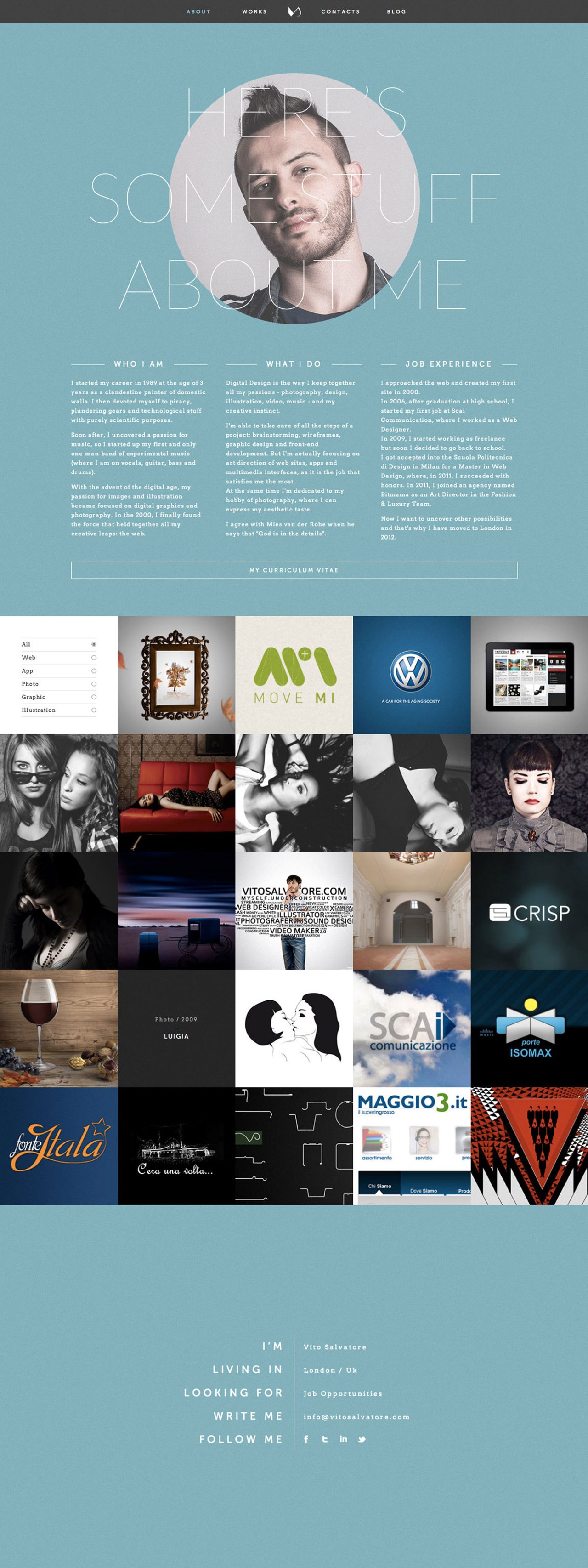
Vito Salvatore
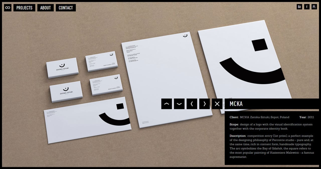
Perconte
A lot of companies get the full screen + keyboard navigation concept wrong, Perconte has got it spot on in a slick minimalistic way. Brilliant job with quality images too.
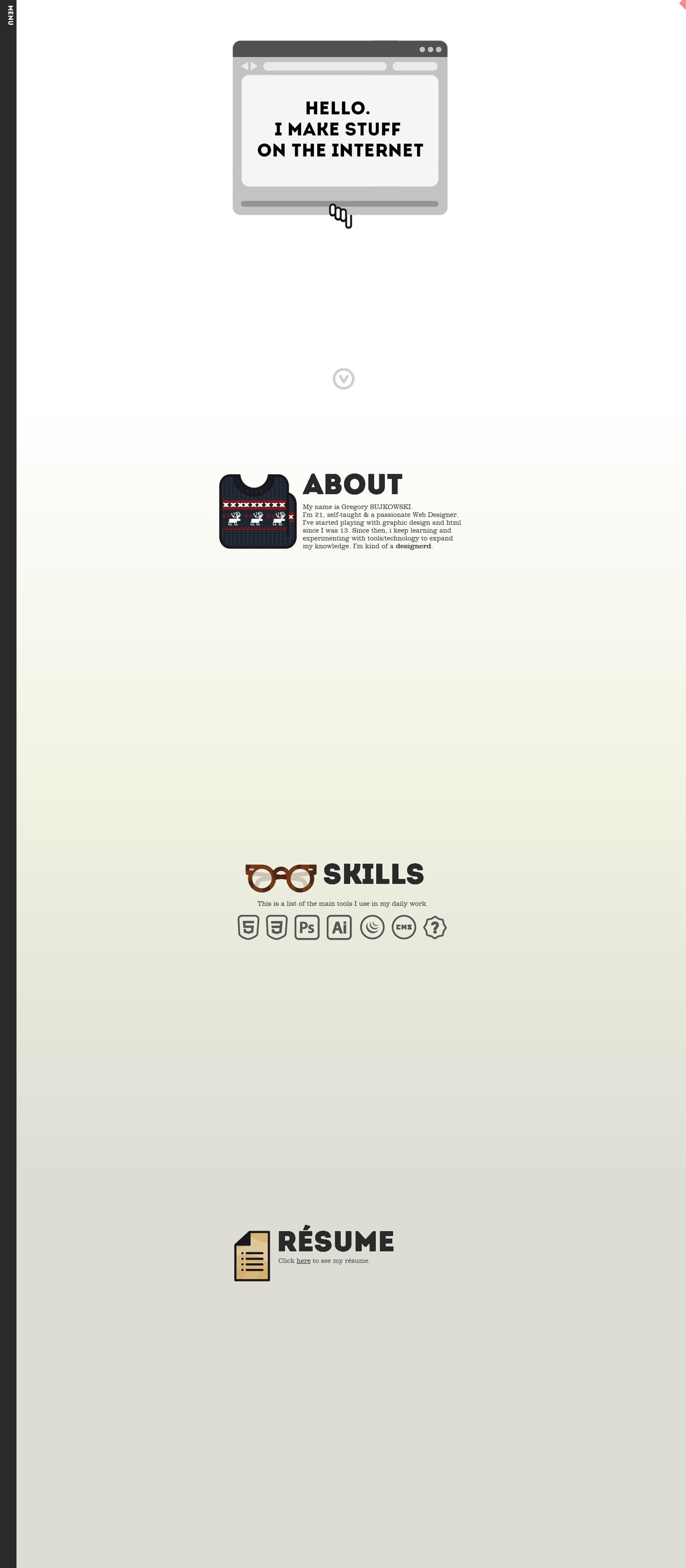
Gregory Sujkowski
Yuna Kim
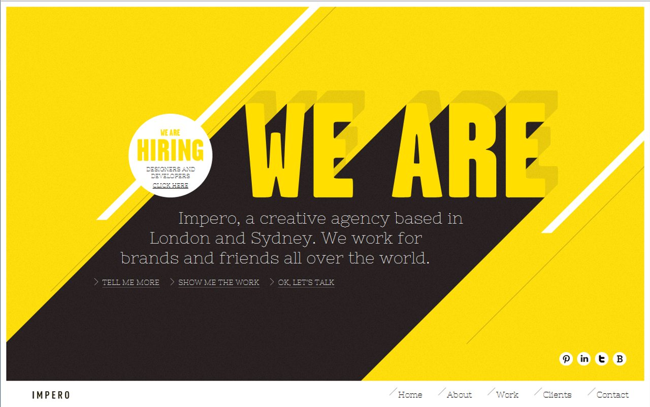
Impero
Pixelmess
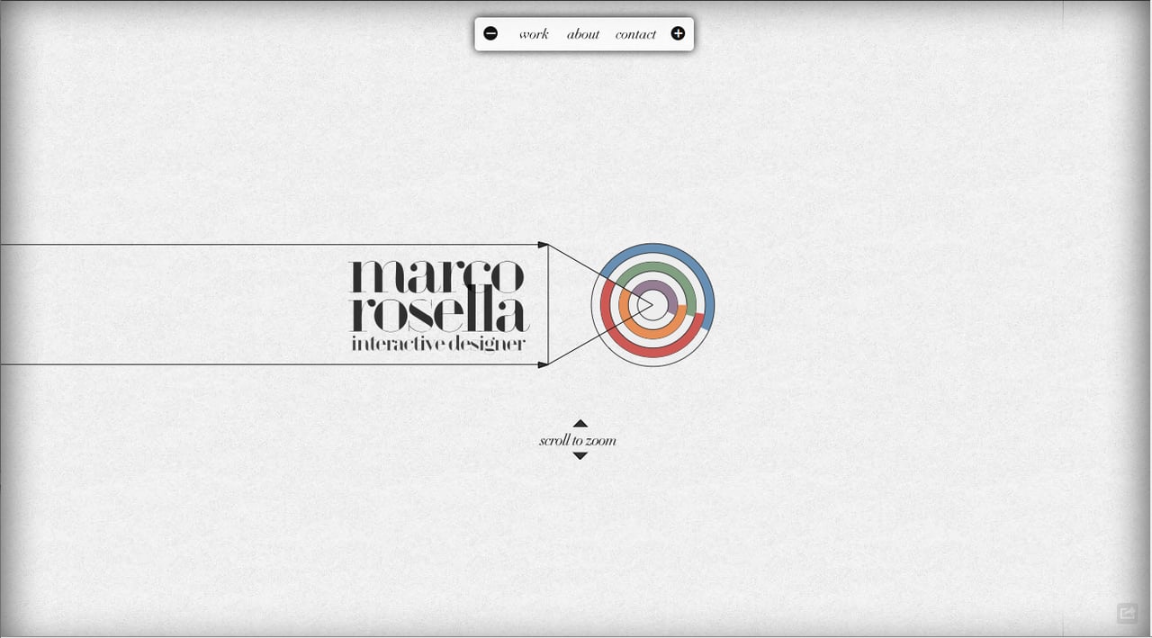
Marco Rosella
Zwart/Wit Media
Theory
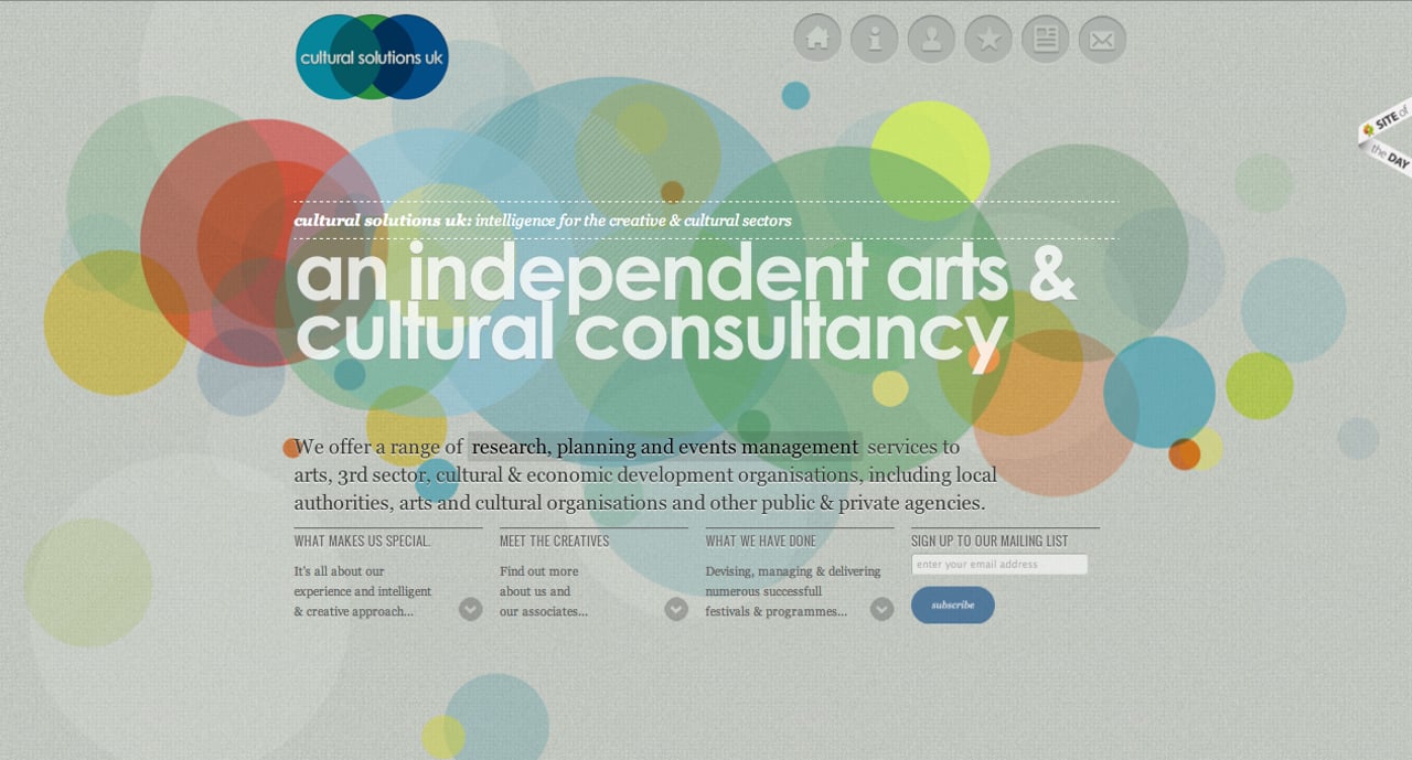
Cultural Solutions UK
Demi Creative
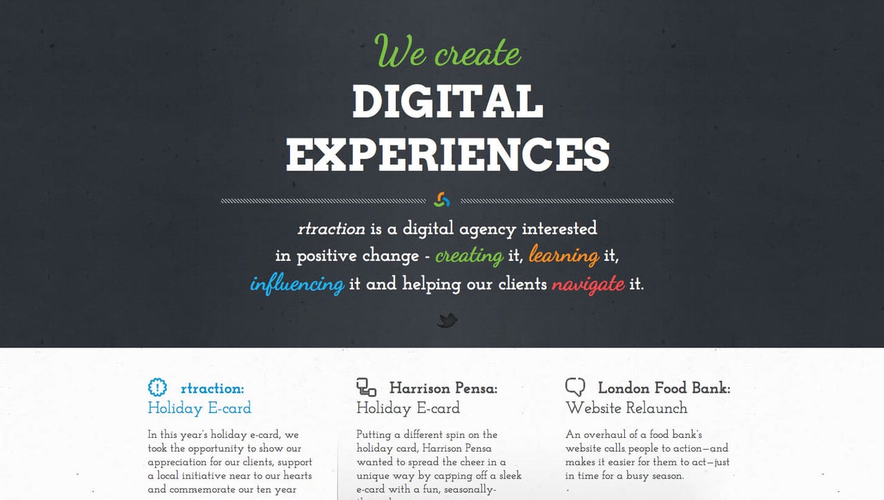
rtraction
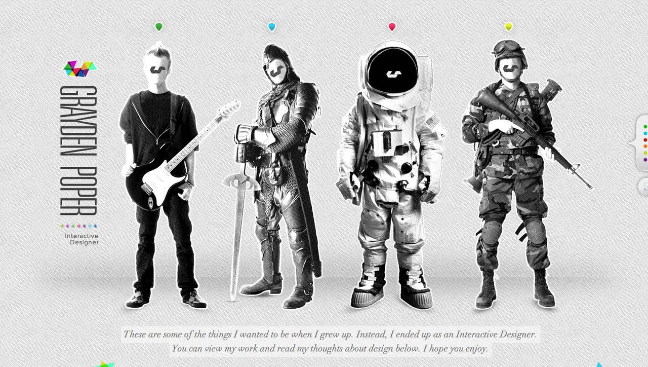
Grayden Poper
Best One Page Product Websites in 2012
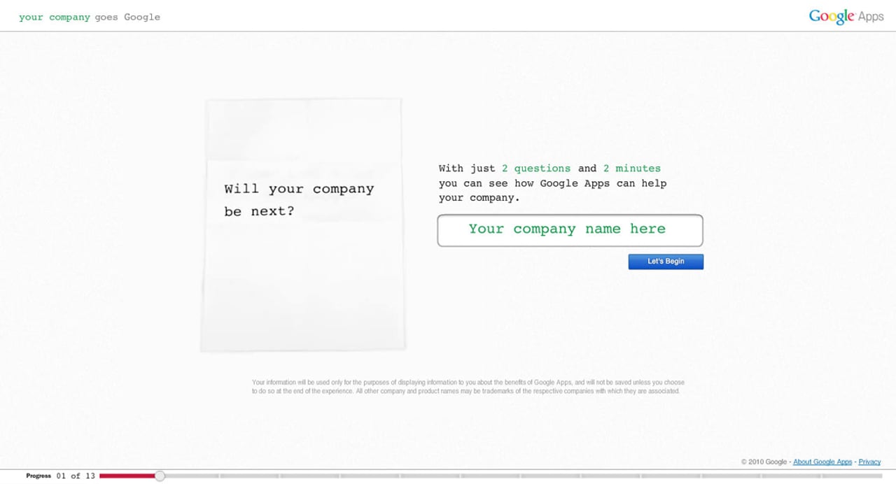
Gone Google
Sure you heard of, or even using Google Apps? Well the big G has launched a brilliant interactive campaign where you can calculate the benefits of using their Apps platform for your business. At the end you can even export the results to pitch at your next meeting.
Samson Brewery
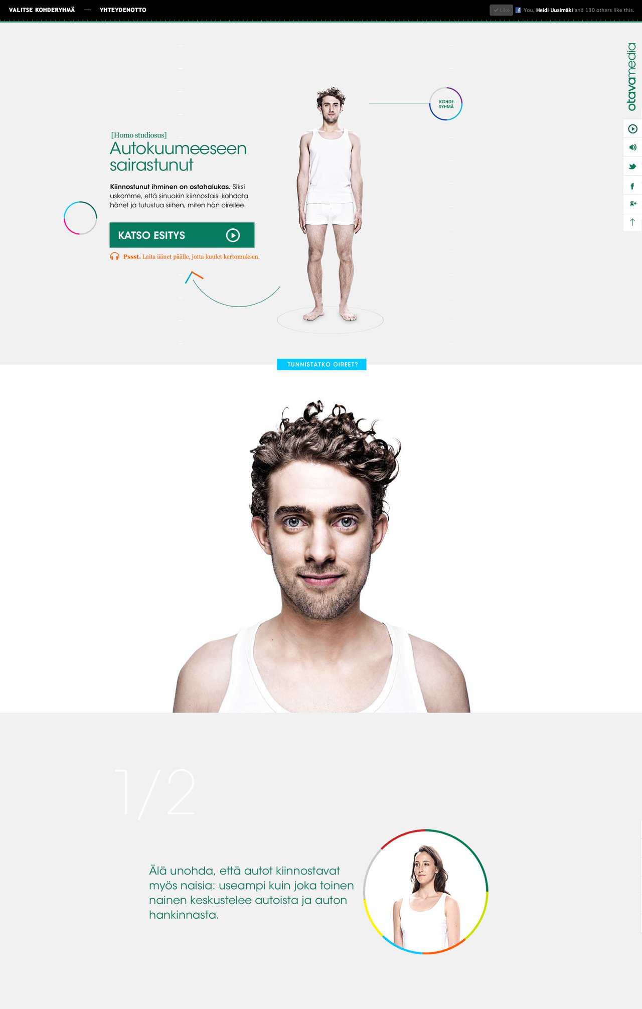
Homo Studiosus
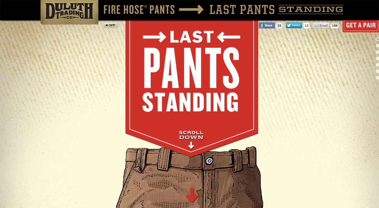
Last Pants Standing
The site not only features masterful Parallax Scrolling but it is actually hilarious!
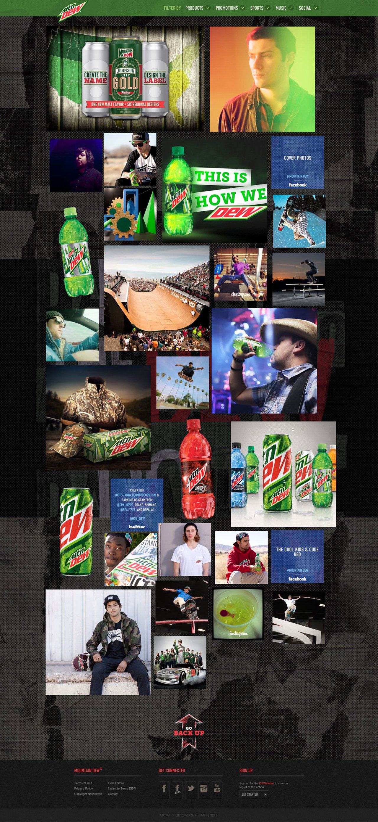
Mountain Dew
Great to see big (more like huge) brands taking the One Page route. The Mountain Dew site showcase masterful AJAX loading while rearranging the content in the page.
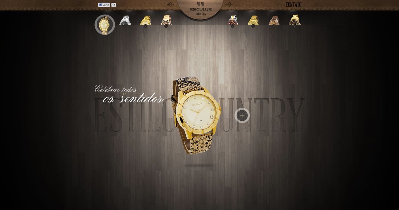
Seculus Country
Quite a wait for the site to load with the preloader but some gorgeous big images of the products.
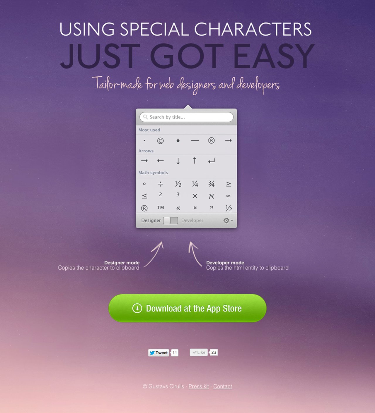
Characters mac app
I absolutely love the load transition against the moving background, very original creating a great first impression. Check out our interview with the creator, Gustavs Cirulis, with some insight on the build.
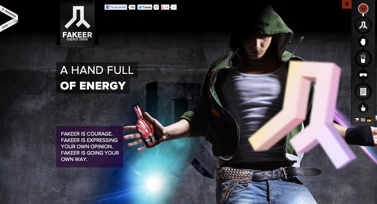
Fakeer
Not the best looking preloader but spot on with concept. Fakeer seems like a pretty bad ass drink and their design correlates with their image. Mega parallax scrolling against a solid background with a grunge feel. With a market so saturated you'll need this first impression for new users to remember you when scanning supermarket shelves.
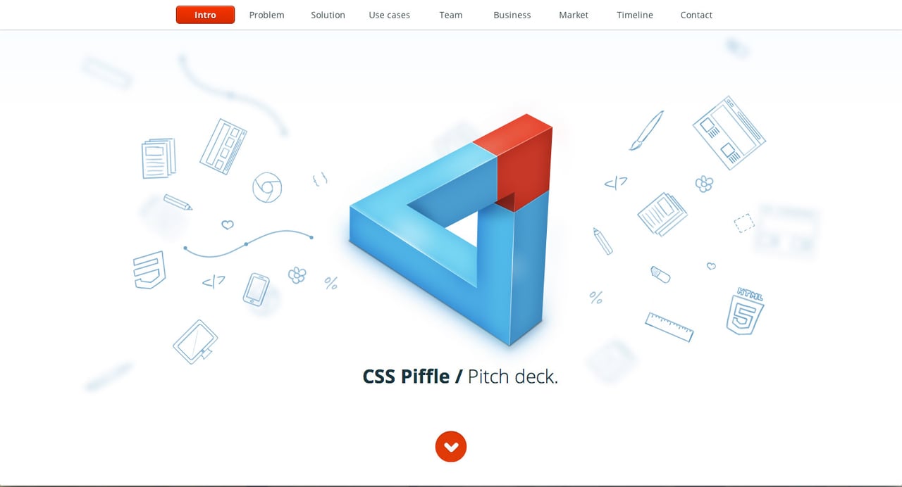
CSS Piffle Pitch Deck
Air Jordan 2012
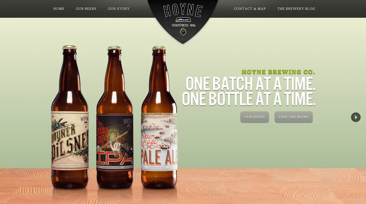
Hoyne Brewing Co.
Best One Page Launching Soon Websites in 2012
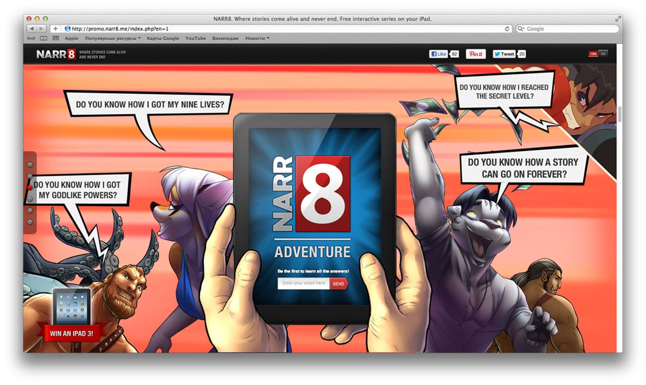
NARR8
LOVE how the hands change as you scroll through sections.
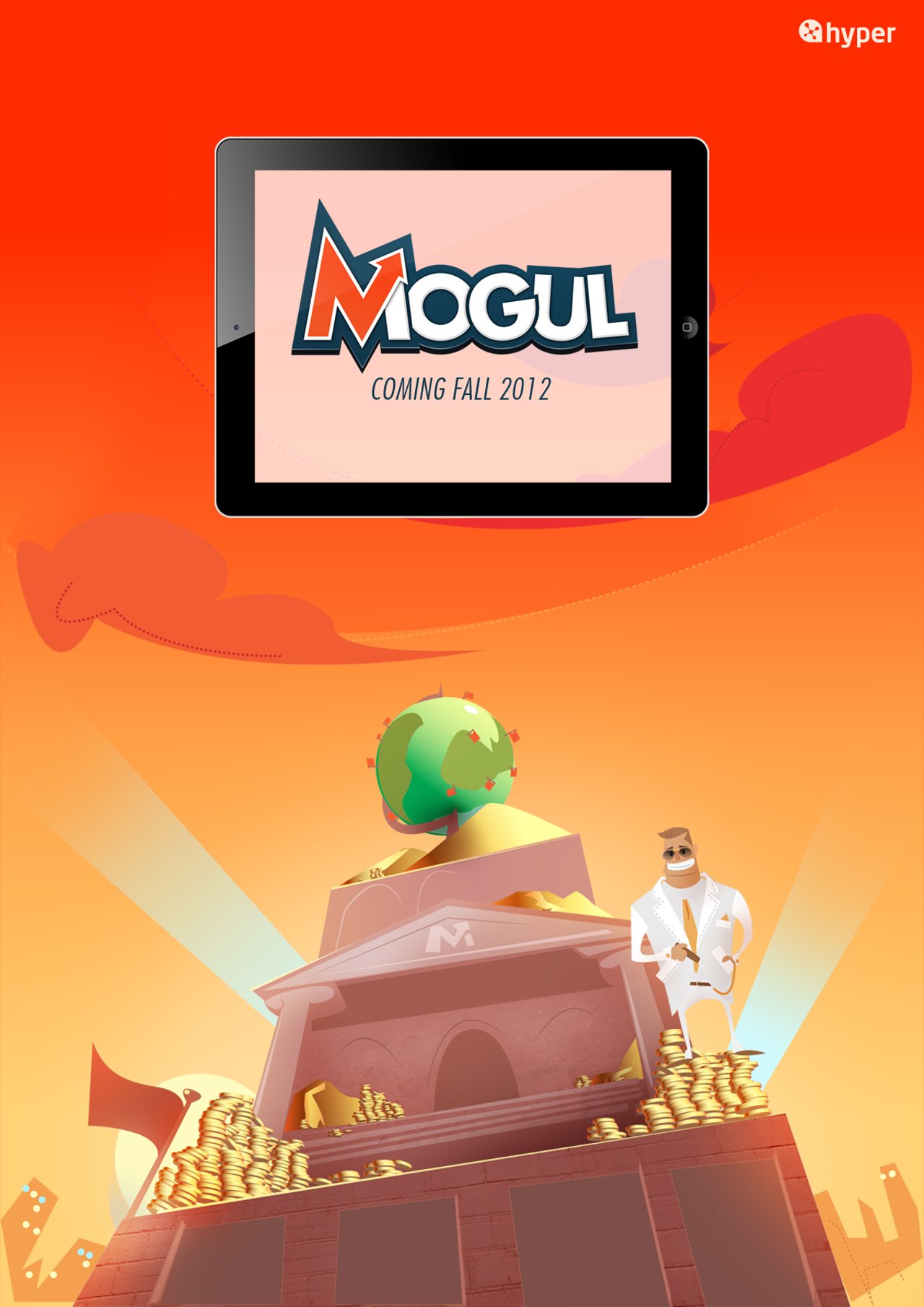
Mogul
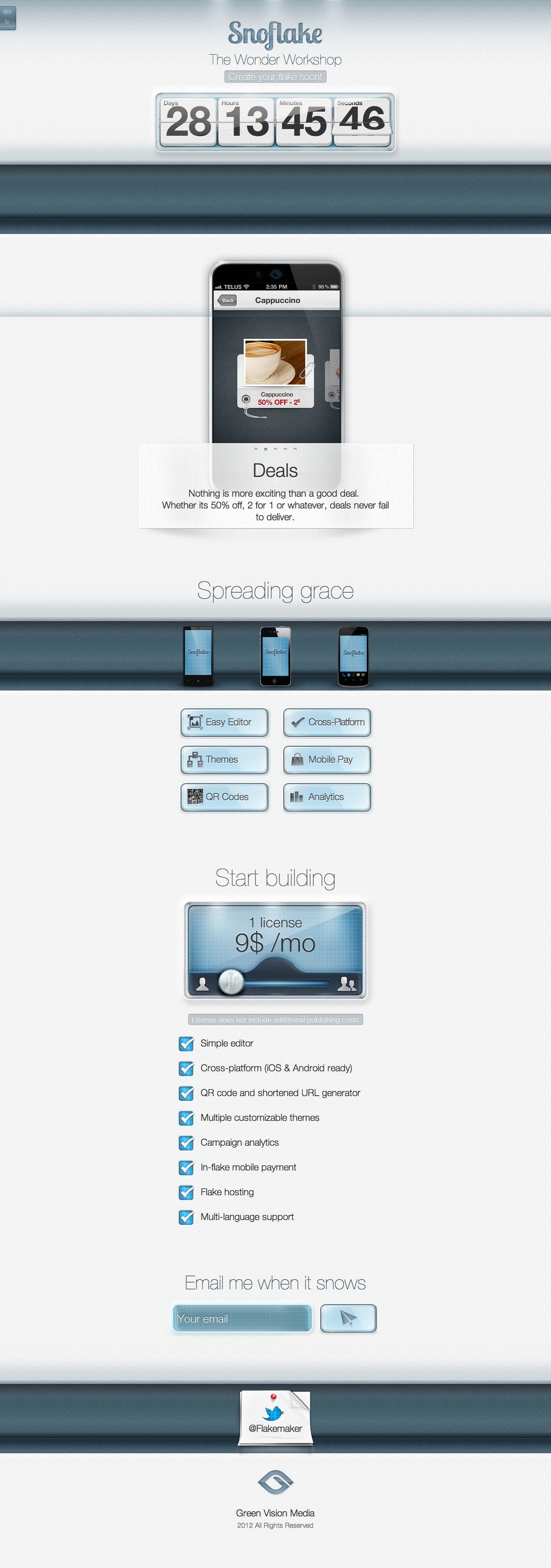
Snoflake
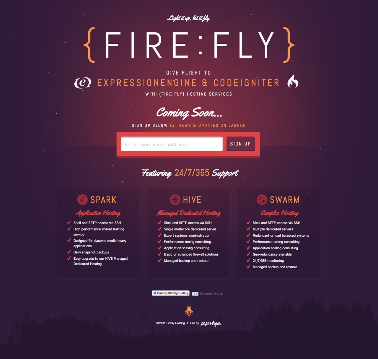
FireFly
Best One Page Game Websites in 2012
Pudding Rush
Incredible interactive One Pager! More info on the build here.
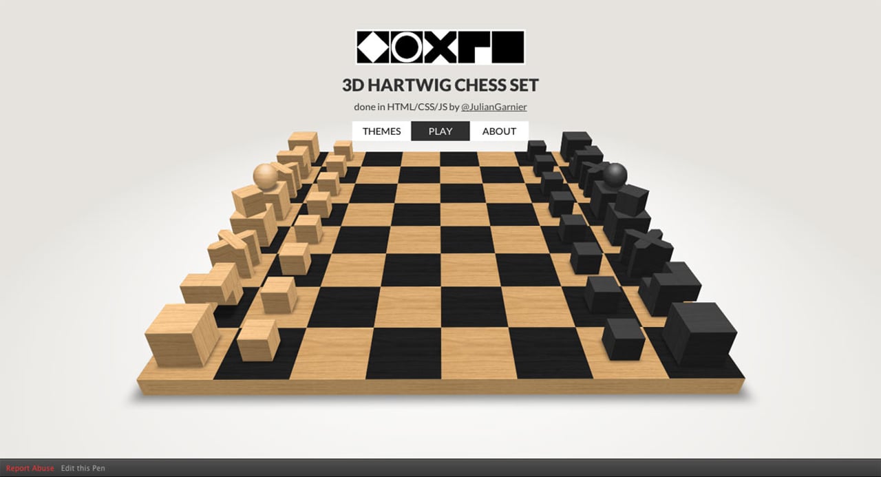
3D CSS Hartwig chess set
Mailboxing
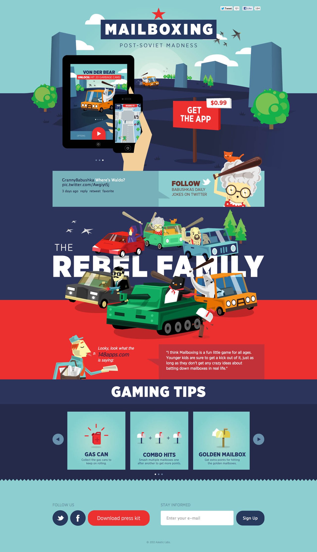
The Mailboxing game website is one of those sites you land on and you literally scroll down and up several times to take in the awesomeness. Its busy yet bold and minimal. The color is just bursting out the screen and that double ipad/iphone slideshow is really the x-factor for me. I recently interviewed Asketic team member, Austris Urtans
Progetty Studio Arcade Version
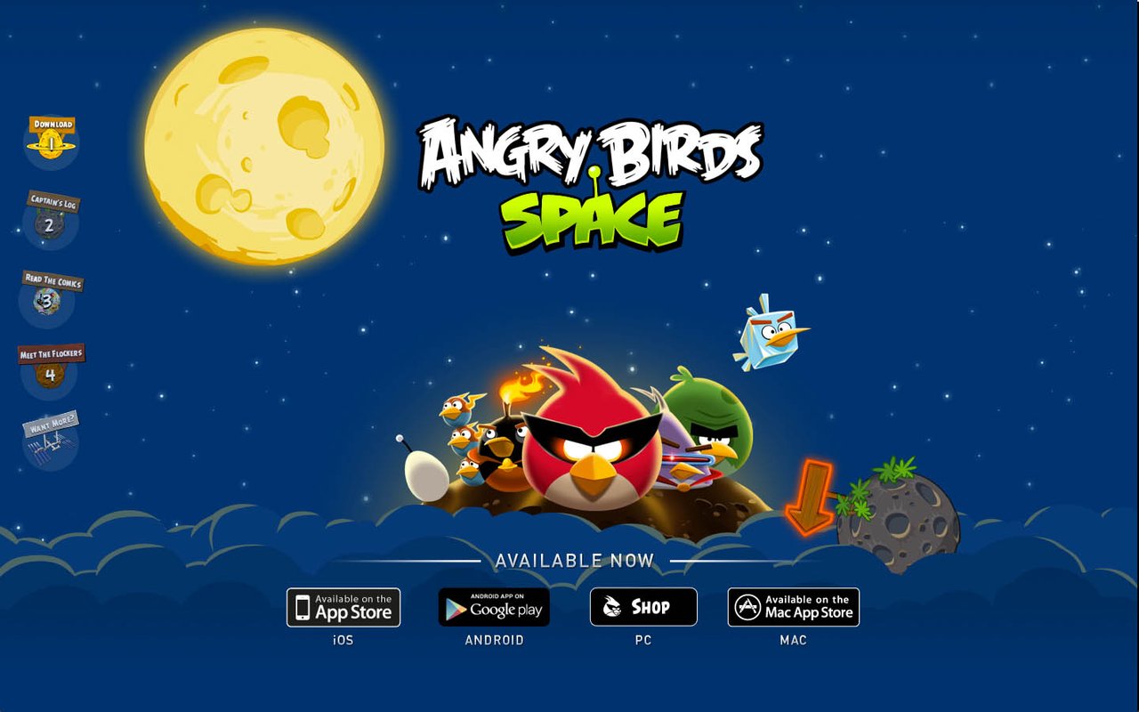
Angry Birds Space
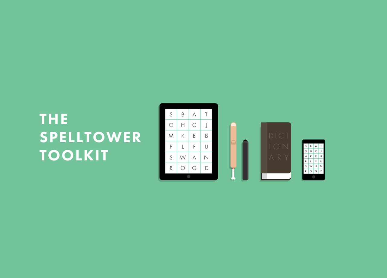
SpellTower
Best One Page Landing Page Websites in 2012
Everpix
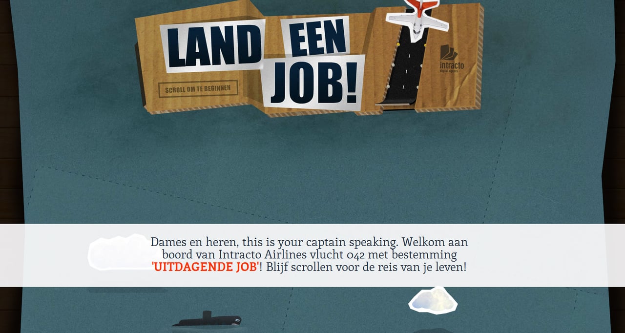
Intracto – Land a job
Sites like these just make me smile... loving the crazy little plane cruising around. A lot of effort for a job posting but no doubt got people talking!
Best Uncategorized One Page Websites in 2012
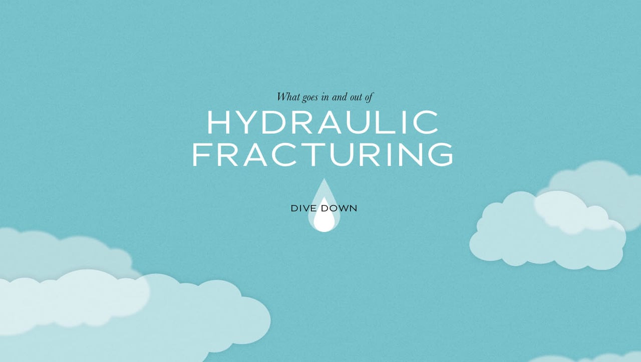
Dangers of Fracking
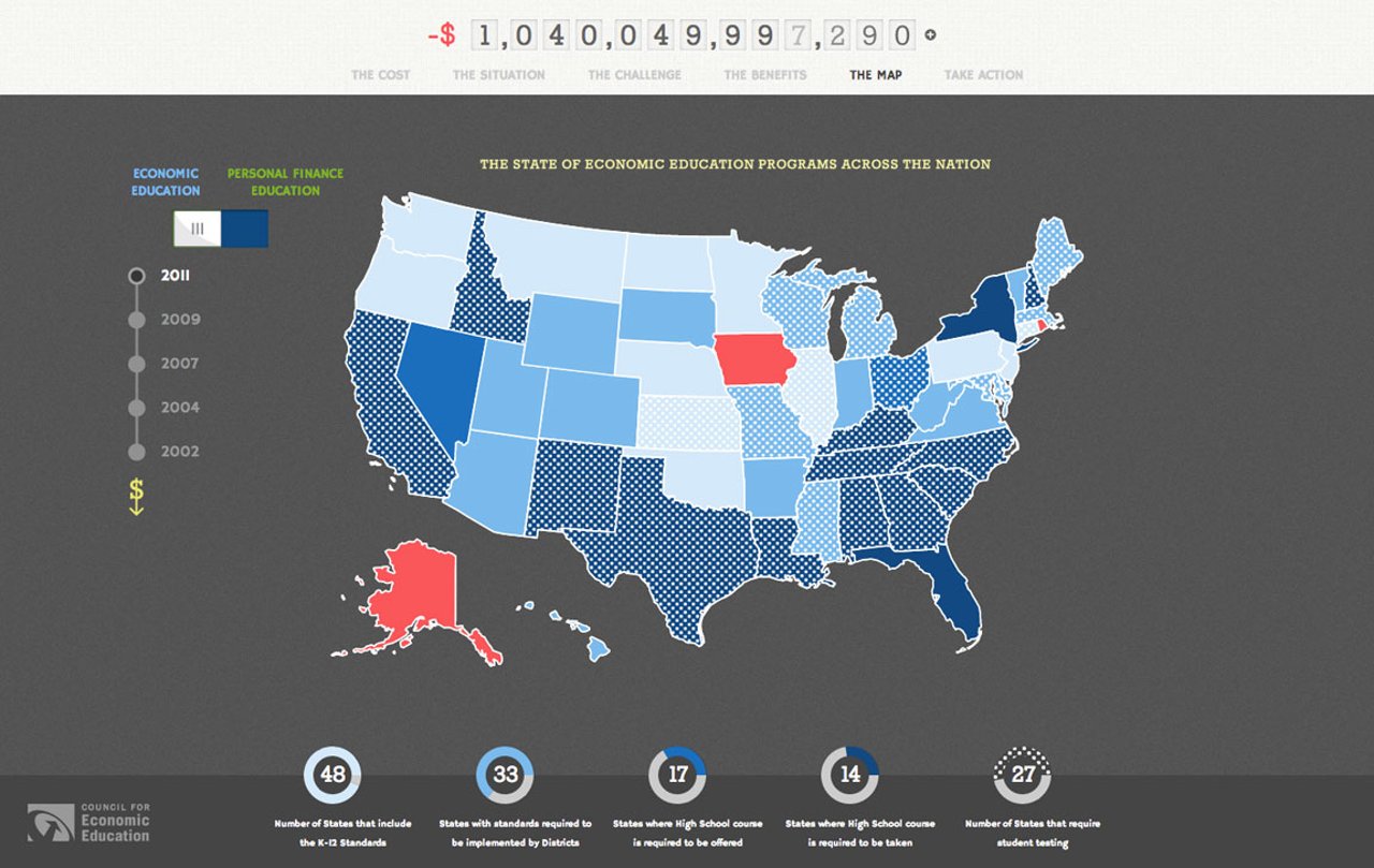
State of Financial & Economic Education in US
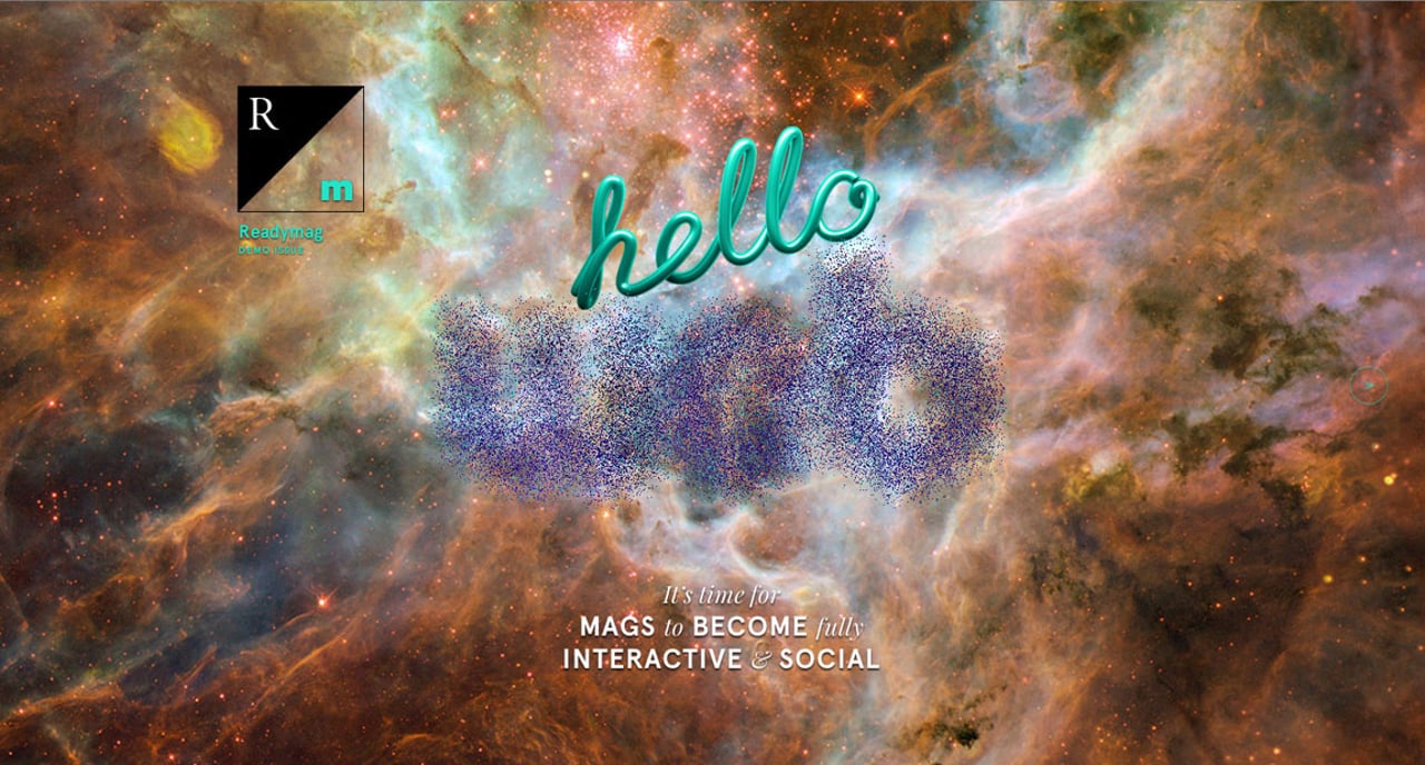
Readymag – Demo Issue
Great to see another online magazine with a unique layout like this one from Readymag. I'm predicting lots more of magazine creating unique full screen online sites instead of going print.
Readymag – Demo Issue
Great to see another online magazine with a unique layout like this one from Readymag. I'm predicting lots more of magazine creating unique full screen online sites instead of going print.
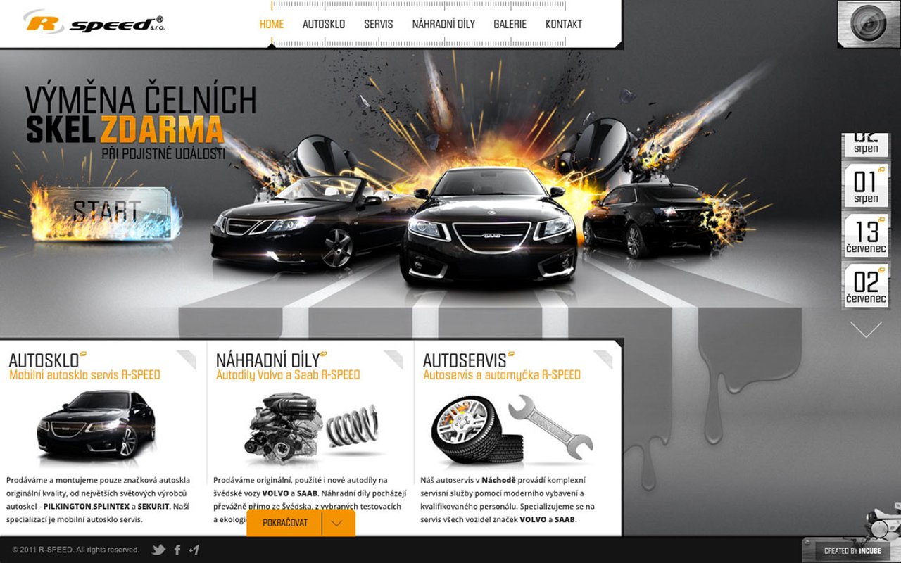
R-SPEED
So your business is repairing cars. You can choose to create a generic bland brochure site... or this absolute monster One Pager!
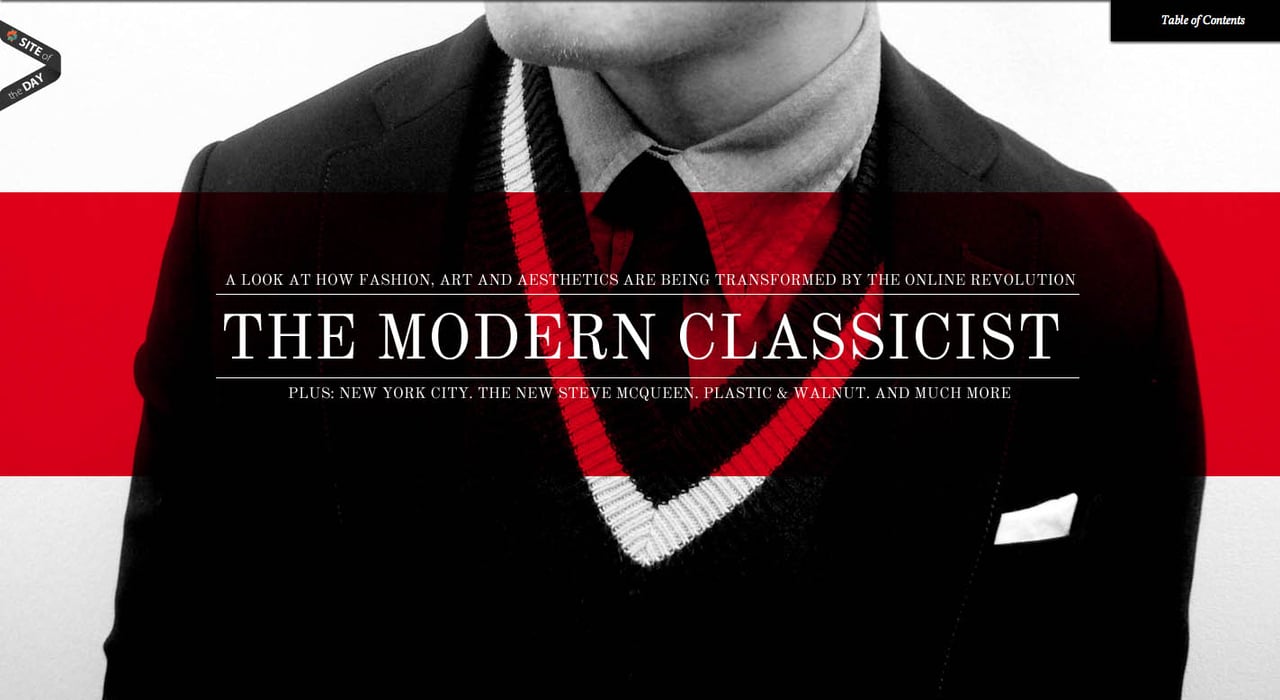
Suit Up or Die Magazine #1
Not the biggest fan of those flash flip magazines. Is there an online alternative? Check out the 1st issue of 'Suit Up or Die' Magazine. A great job with Parallax Scrolling and big full screen images.
The Interactive UK Energy Consumption Guide
Interactive infographics, loads of color and beautiful illustrations... was a no-brainer this was instantly 'Most Loved' for July, definitely a contender for one the best One Page sites for 2012.
Putzengel
Besides the lovely design and interactive elements, there are some really unique parallax features all within the cleaning theme. Take a look for yourself... crumpling paper, spraying detergents and sponge swiping. Lots of love in this One Pager for a cleaning service.
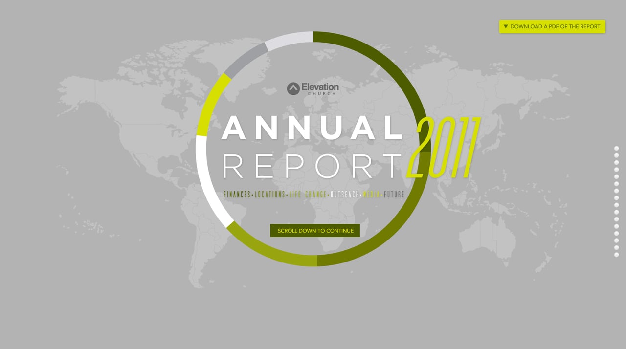
Elevation Church Annual Report
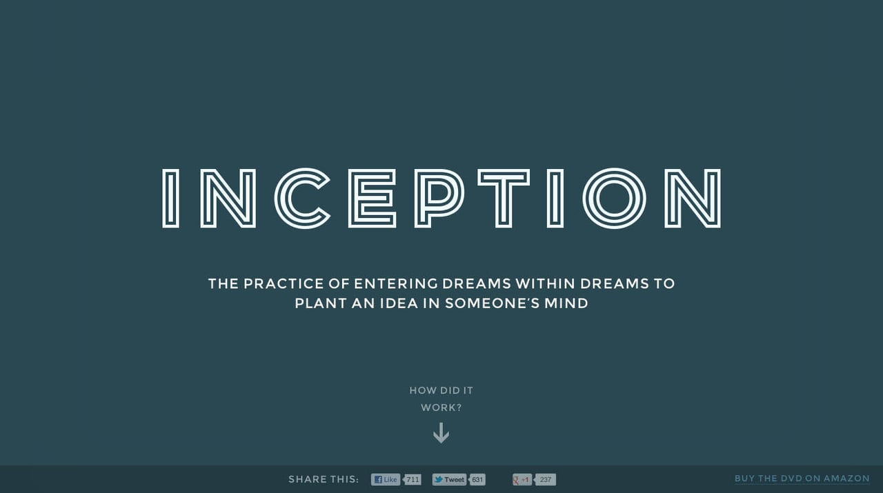
Inception Explained
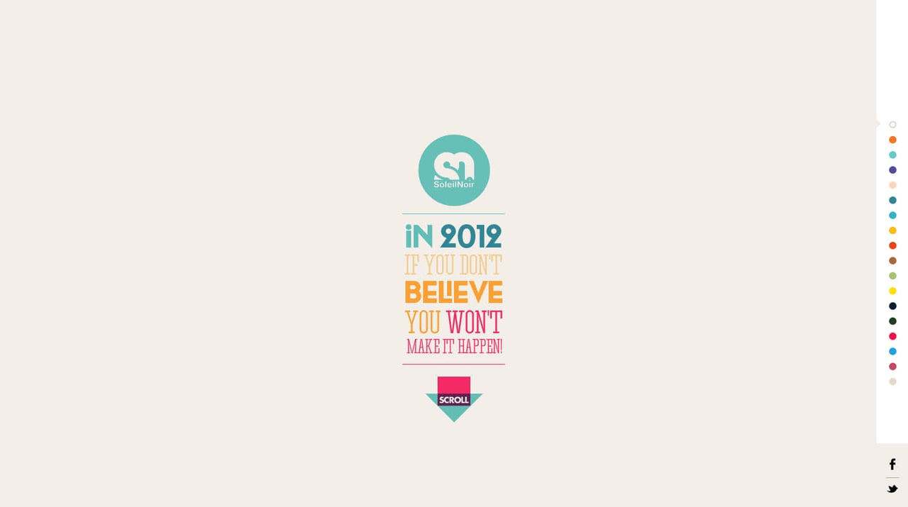
We believe in…
Cambridge Healthcare
The majority of sites within the health sector are terribly designed so you can imagine my surprise when Andrew Lucas submitted the beautiful Cambridge Healthcare site to us. I caught up with Andrew and asked him a few questions about himself, his role in the site, approval process and how he requests all the fine details in the development. Read the interview here.
What an inspiration overload! Hope you enjoyed the hand-picked collection from 2012... before you put that scrolling finger on ice, why not help spread the love:)
Need more inspiration? Here is the website of the year archive:
2018, 2016, 2015, 2014, 2013, 2012 🔥
Hope you found a few good refs in there. Remember I’m always looking to add more quality examples for our community so hit me up on the twitters or email if you stumble upon solid ones.
Much love,
Rob
Twitter: @robhope
Email: [email protected]
