← All typefaces
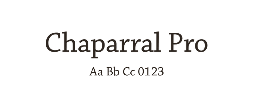
Chaparral Pro
Carol Twombly’s Chaparral joins the sturdy serifs of nineteenth-century slabs with the proportions of Renaissance book lettering. The letters vary in width rather than following a strict geometric scheme. Optical-size variants help carry that combination from reading text into larger, more expressive typography.
- Style
- Serif
- Designer / foundry
- Adobe Originals ↗
Websites using Chaparral Pro




Chaparral Pro font pairings
Used together in our collection. Open the examples to see how each design combines them; font credits do not specify which font is used for headings or body text.