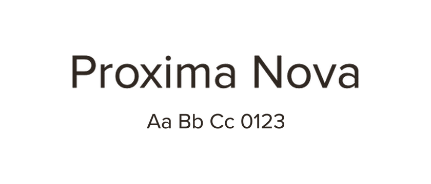
Proxima Nova →
The reference: compare the balance of geometric shapes and text rhythm in the original layout.
Compare Montserrat, Lato and Manrope as open-source directions for websites using Proxima Nova.
Proxima Nova sits between geometric and more traditional sans-serif forms. A replacement should be chosen for the part of that balance your design uses: the shape of a big headline, the rhythm of a paragraph, or the feel of small navigation labels.
Montserrat takes the comparison toward a more geometric and emphatic headline. Lato offers a warmer, more humanist direction for mixed headings and text. Manrope is another geometric candidate to test in a contemporary landing page. Each changes the tone; none reproduces Proxima Nova exactly.
Compare an actual page rather than matching one attractive word. Check the lowercase a and g, the width of long headings, and the numerals in prices or statistics. Adjust weight and spacing independently, and confirm the required language support. Open the specimens and website examples below to judge the differences in context.
The reference: compare the balance of geometric shapes and text rhythm in the original layout.
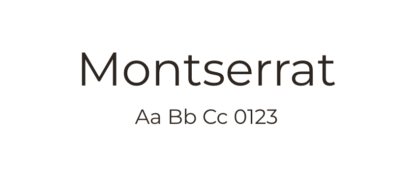
A more emphatic geometric direction, particularly worth testing in large headings. Longer text will have a different texture.
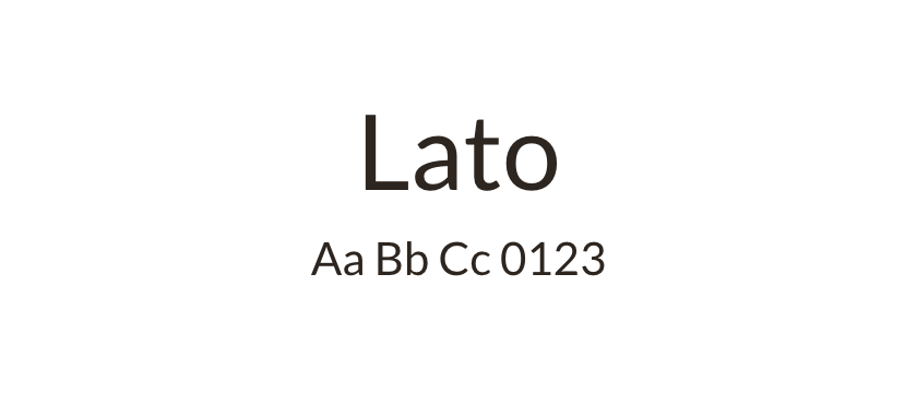
A warmer alternative for paragraphs and everyday text. Use it when the overall reading rhythm matters more than matching the geometric character.
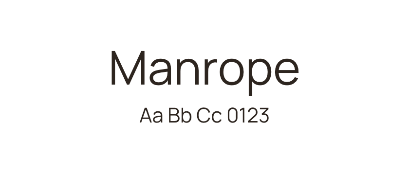
A geometric candidate for a more contemporary interpretation. Test the lowercase details, numerals and heading widths before replacing an existing family.


